Interactive
Tournament Bracket
UI Lead
Penguin Random House | 2017
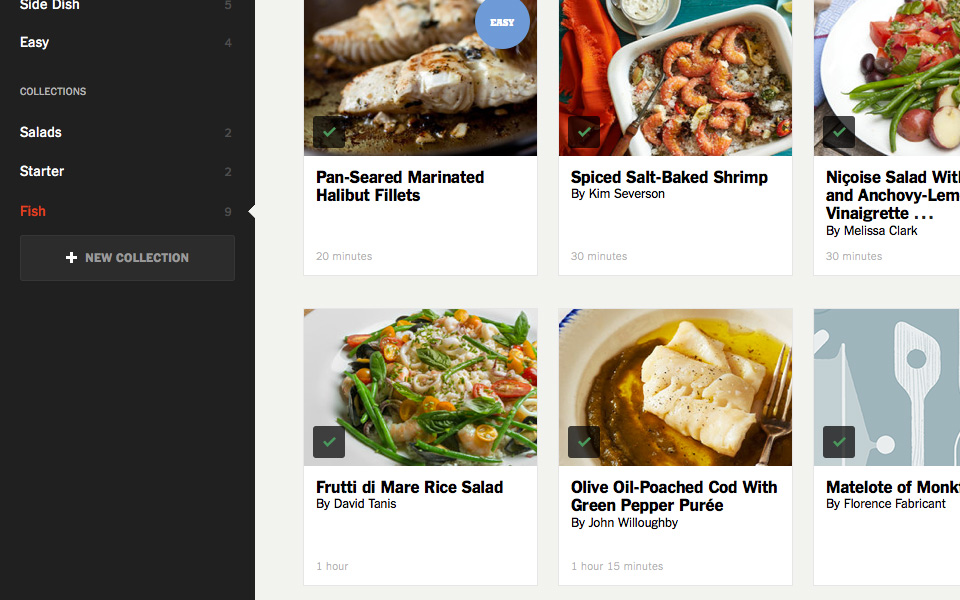
The editors at the sci-fi / fantasy marketing vertical Unbound Worlds hold an annual online tournament pitting fictional characters against one another in voter determined matches to decide a single winner.
Their product team wanted to create a more interactive experience for the tournament bracket as opposed to previous years which was a large static image, manually updated round by round and not very mobile friendly.


First, I had to do some research. I have read through hundreds of tournament brackets but had never really studied their design mechanics before. There are some tricky rules you have to follow: Player seeding ranks need to be included. Naming conventions have to follow the player / team throughout the bracket. Images and color coding are really helpful for easy scanning. Spacing plays a big role in how matches and bracket quadrants are perceived. Crowding increases as the rounds progress, and bracket quadrants close in on one another when more text is included.
I looked at several different kinds of brackets and types of tournament subject matter. Another lesson learned: Overly designed brackets use up alot of valuable space for necessary player / team and match data.


I decided on a really spare bracket design to help highlight the players and their really cool avatar icons. I was able to jump ahead to some prototyping so I could play around with the UI as I developed the bracket design.
For my first pass, I tried a top / bottom format instead of the traditional left to right. While it was easier to scan, the intuitive flow wasn't as clear as traditional designs. To account for some of the eye tracking problems as a player progressed, I came up with a path finder interaction that illuminated on rollover.


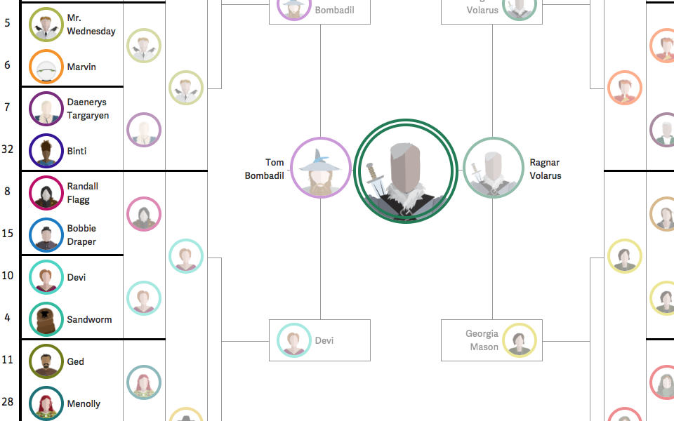
We went back to the more traditional left to right format which made the bracket really tall but we felt like that was OK for a desktop view. As you can see, the bracket progresses in a pretty traditional manner but to create space for later matches, previous rounds needed to be collapsed to show only the player icons.
While that served the overall design brief, I wasn't really satisfied as it kept the bracket from being a living document that people could visit or revisit each and every match in each and every round. I started thinking about a UI that would allow the user to interactively expand and collapse older rounds, just like you would with an accordion menu.
We all loved the player pathfinder UI so it was greenlit for final design but unfortunately left on the backlog as the developers ran out of time.

The final design. The UI worked like I hoped it would and, as you can see, it's really simple to click onto any previous round to view all of the match information and browse throughout the entire bracket without sacrificing any horizontal view space.


Don't worry, we didn't forget mobile and tablet. Here are their respective designs.
We weren't able to recreate the interactivity for non-desktop views so we concentrated on making matches as clear and easy to read as possible with simple organizing titles to denote rounds. We also were able to repeat these design patterns elsewhere when we wanted to present a quick recap or a way for a user to circulate from match page to match page.