Accelerate
Design
Penguin Random House | 2015
In 2015 Penguin Random House began experimenting with in-house innovation groups as a way to promote and foster new programs and initiatives. The program was so successful that it was decided they would gather all of the groups into one and call it Accelerate.
They decided that they needed a logo to help promote themselves within the company and they asked me if I would help.

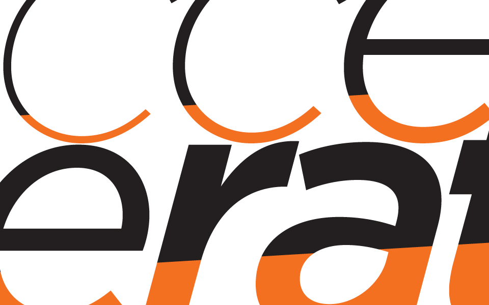
They wanted something that exemplified speed, innovation and progress. This image served as a basis to convey an idea of movement that might have some connotations of ascension as well.
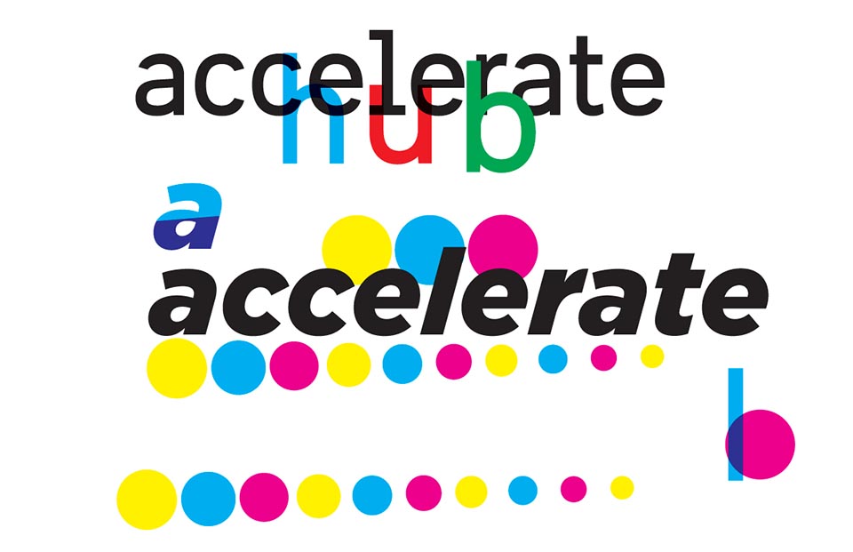
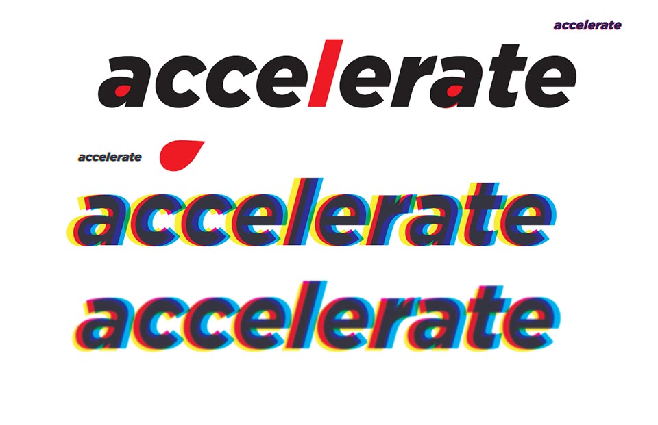
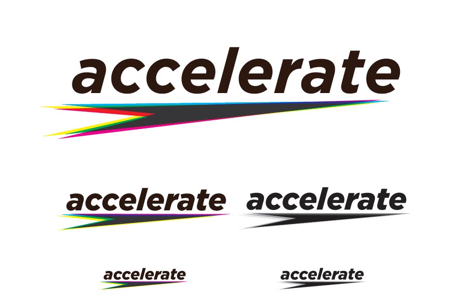
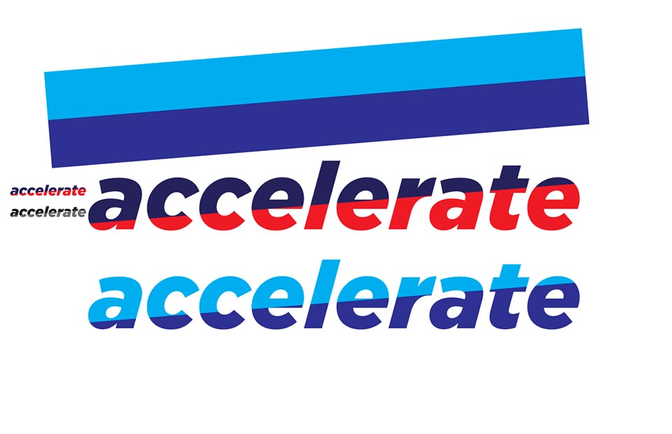
Preliminary sketches and some of the rounds of comps. After a few rounds they decided they wanted to embrace the company colors and use only orange and black.
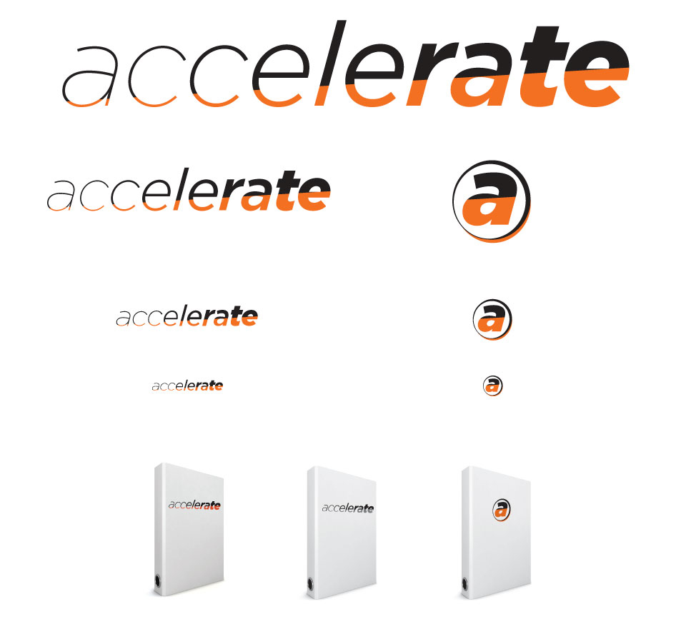
The final wordmark, lettermark and some sizing guidelines.
