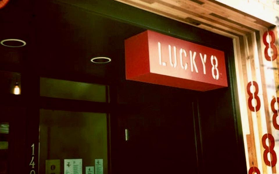
Lucky 8's
Branding and Design
Seattle | 2010
This client was opening his first restaurant, and asked if I would do the identity branding along with some of the collateral. The theme was Asian kitsch as an ode to classic Chinese take-out restaurants.
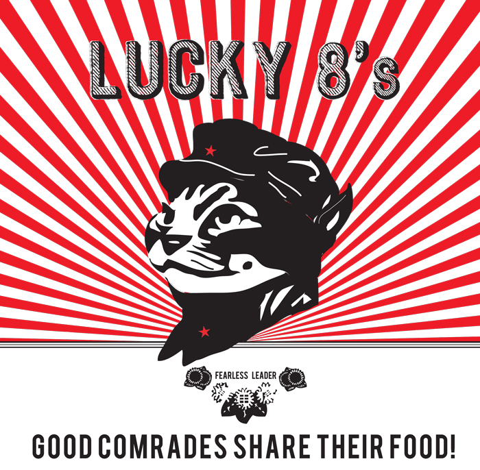
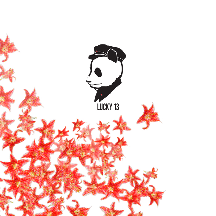
I looked at several different inspiration sources: Chinese Communist propaganda posters, Japanese line drawing, to more abstract ideas that incorporated threads of Asian symbolism. I mistakenly thought the name was to be Lucky 13 at the beginning of the project. We had a laugh about it later.
To save on printing costs, I used a red (a symbol of good luck in China) and black color scheme for the branding. The owner really wanted to utilize a dragon so I had it repeat the upright 8 to help square out the mark. With the easy colors, it also gave them the option to use ink stamps if they needed.
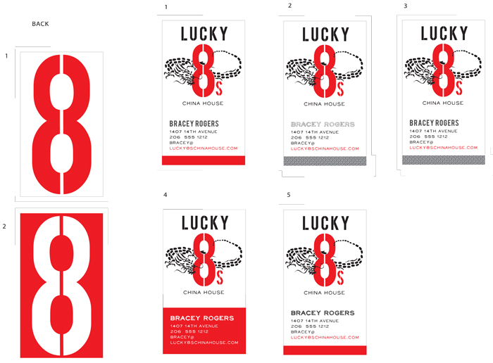
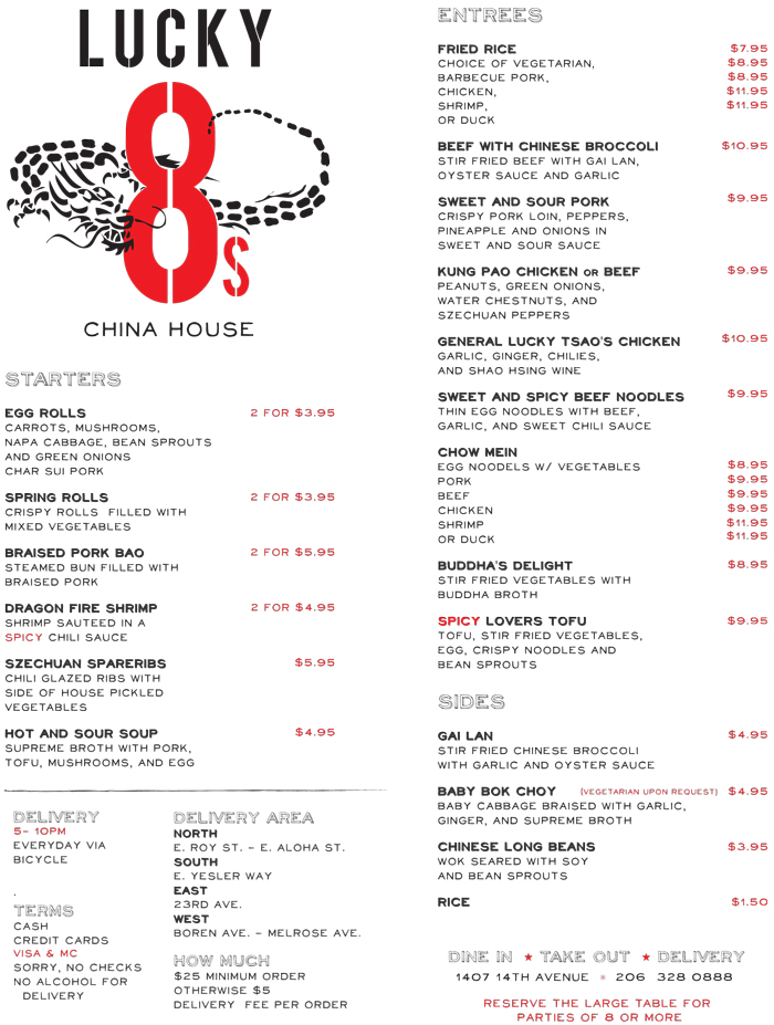
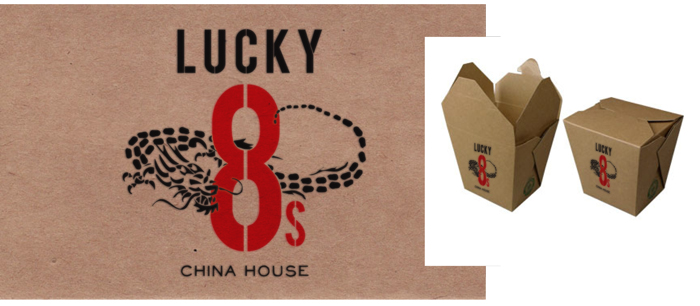
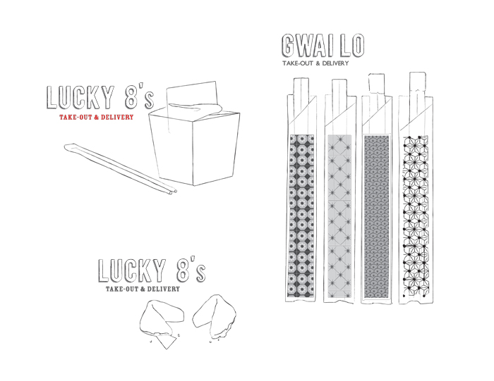
Some of the collateral. What designer can resist creating a menu layout? Also, the business cards and the take out packaging.