The Studio New York
Branding and Design
NYC | 2007
This client started his own acting conservatory and had a major dilemma: Create the look and feel of a longstanding institution but at the same time, seem fresh, new and independent.
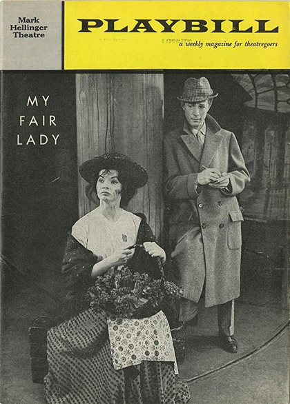
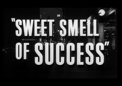

I really wanted to capture the era of mid-century New York City, when it was the heart of the American theater. To achieve this effect, I looked for a narrow grotesque font for the wordmark in stark black and white to reference printed playbills and audition call posters.
The final wordmark. I found if the application wasn't careful it could sometimes disappear into darker backgrounds so I ended up giving it a 3-D effect for maximum flexibility where and how the owner used it.
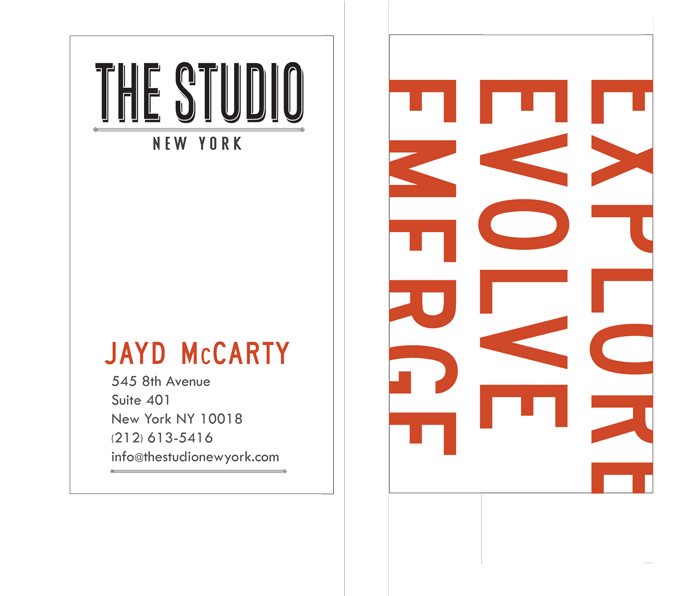
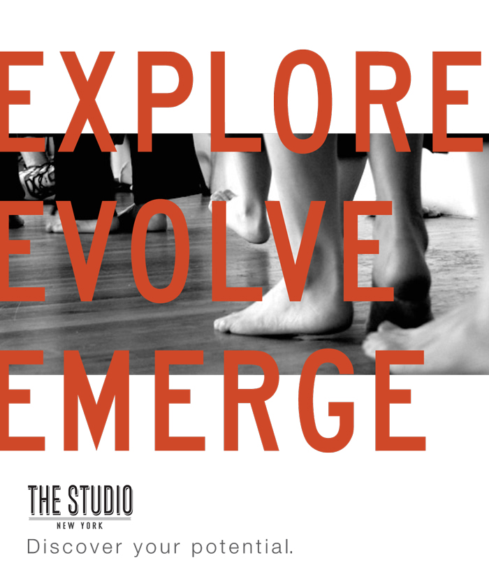
Some of the collateral. The business cards and a promotional poster.
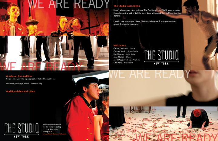
The original recruiting mailer.