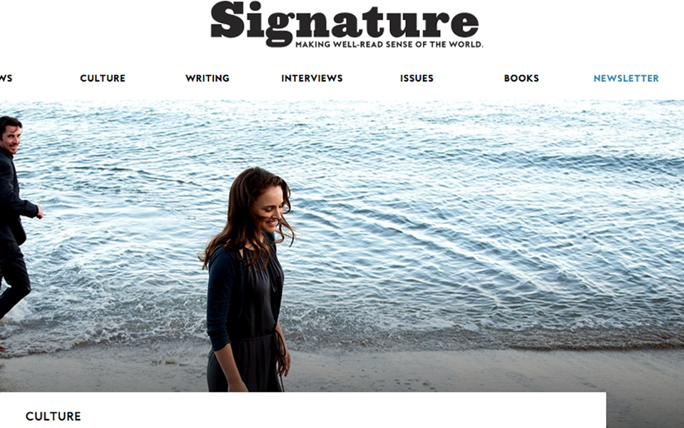
Signature Writing Guides
Design and Layout
Penguin Random House | 20016 - 2018
The business owners of the literary culture blog Signature wanted to experiment with gated content to see if they could increase newsletter sign-ups by offering something of real value to their base customer. They devised a series of writing guides, each curated around a specific theme.
I suggested the design take on more of an illustrative pamphlet look with little to no pictures and clean clear space for the writing to really stand out.
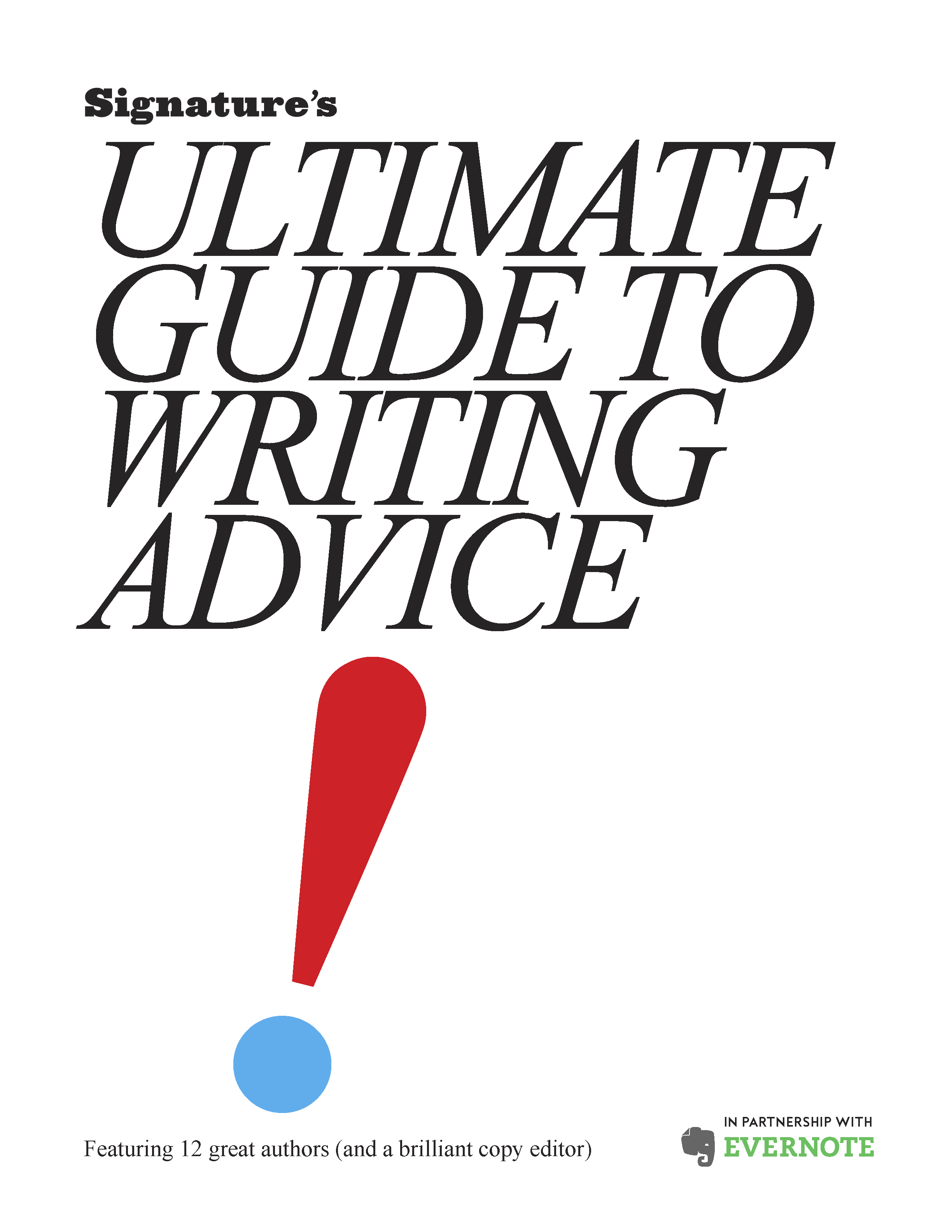
The Ultimate Guide to Writing Advice was the first of the series. I definitely took a Herb Lubalin approach for the font selection and treated the punctuation marks as shapes and patterns. I kept it really spare using only two colors, cyan and red. This one probably was the most true to my initial vision for spareness of any of the subsequent guides.
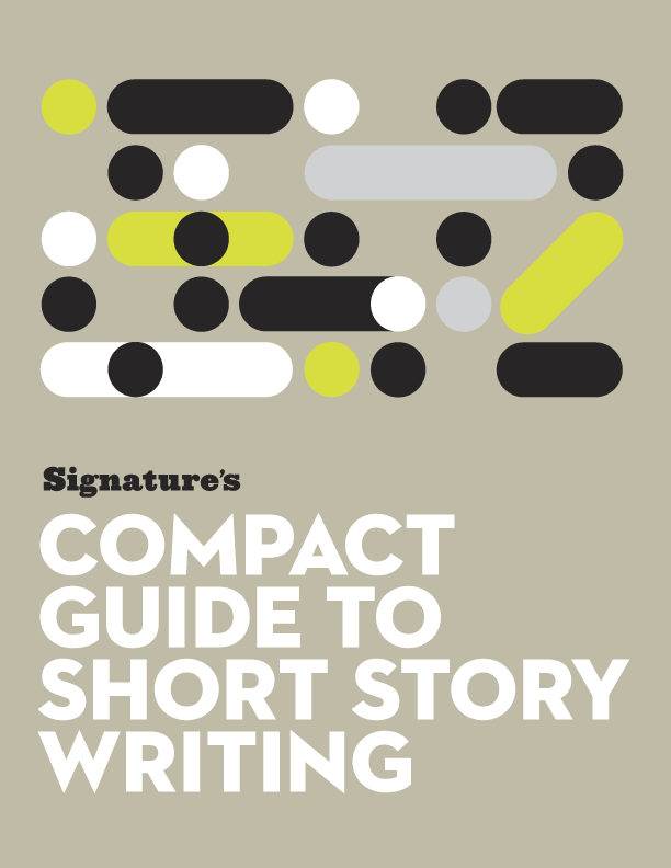
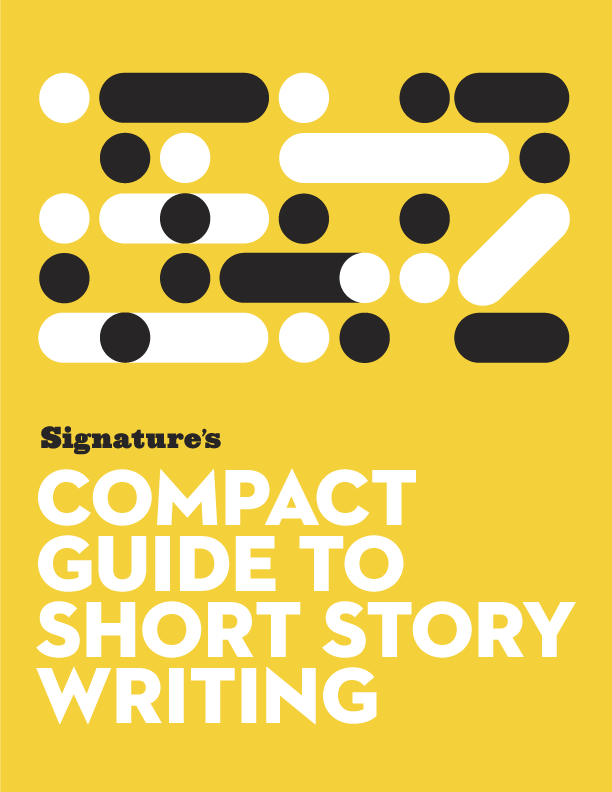
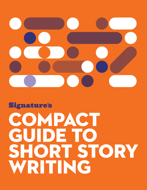
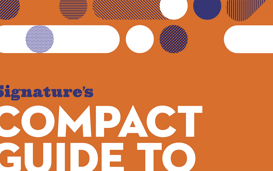
The Compact Guide to Short Story Writing was the second of the series and as is probably apparent, a much more lively design that its predecessor. The business wanted to experiment with more color for marketing purposes so I let it rip. We even tried four different cover colors to test which did the best. The winner: Orange.
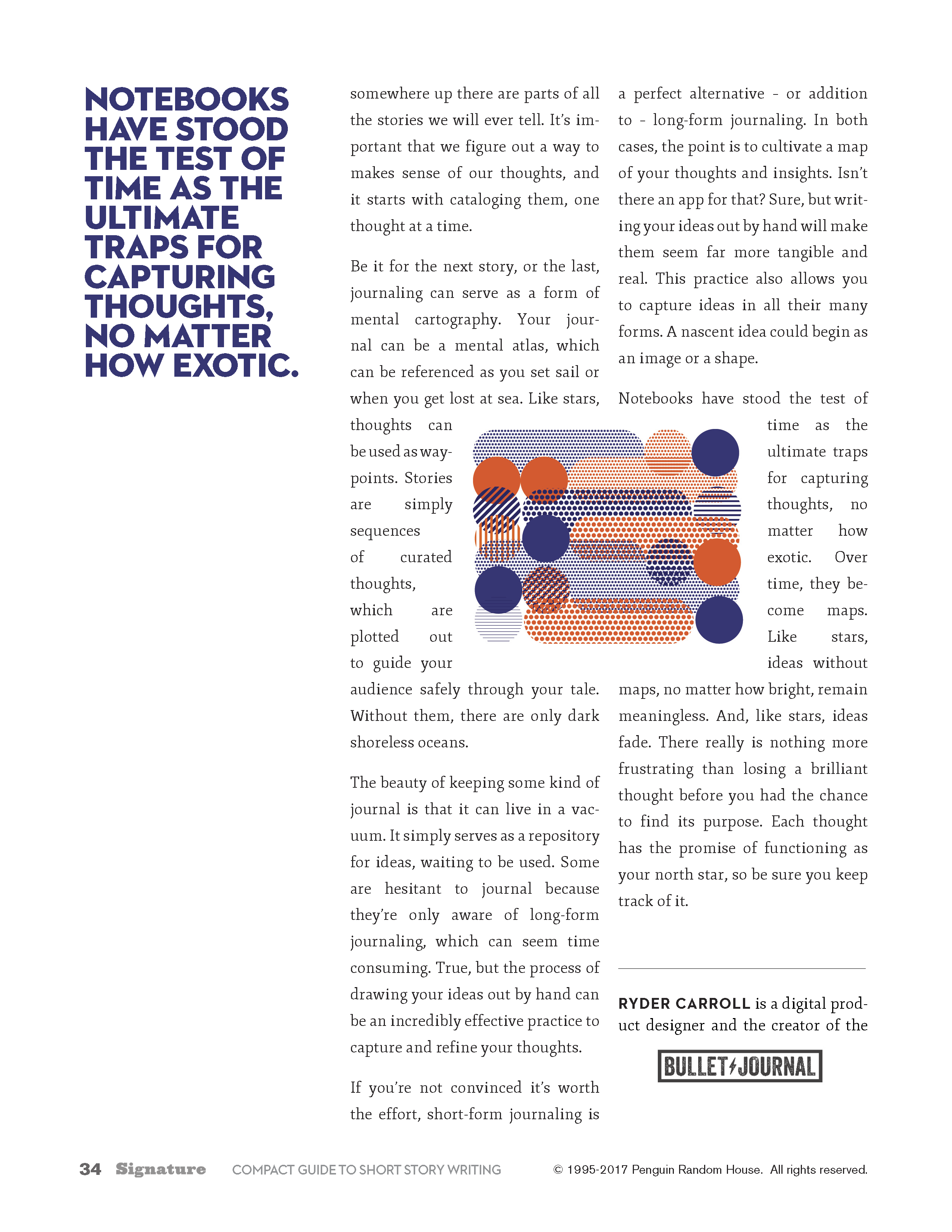
I created a pretty flexible grid that was not too much, not too little for this particular type of layout. It worked so well that we've used it for all eight guides to-date.
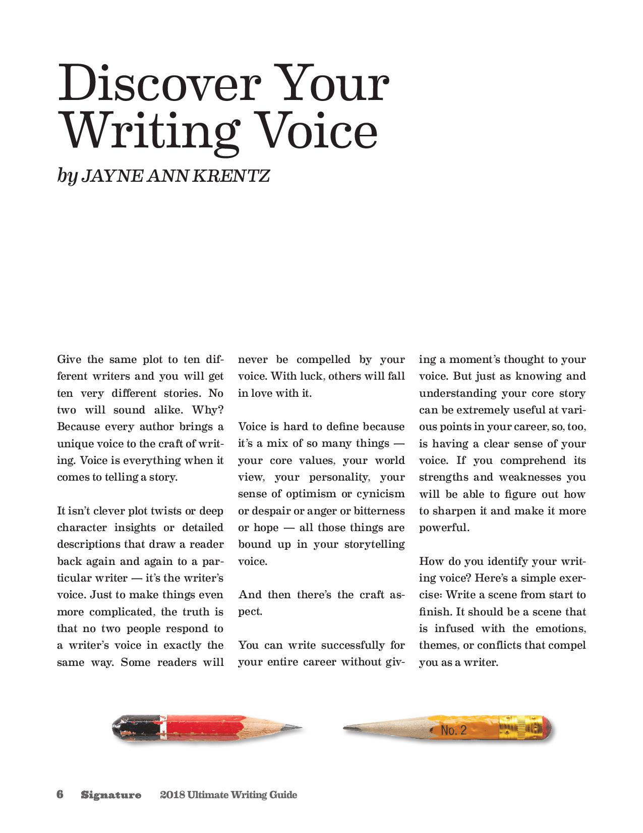
The series concluded with on final Ultimate Writer's Guide. I couldn't resist the urge to frame the design around objects that I love: writing utensils. It might be a bit cliche but I loved looking for different kinds of pens, pencils, erasers and a sharpener or two. The colors reminded me of my school supplies as a kid.