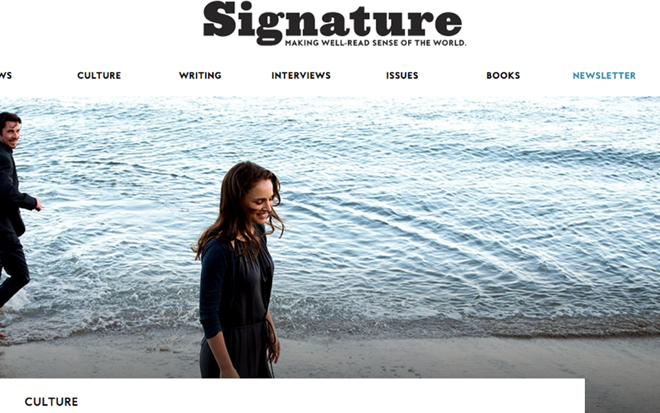
Signature
Visual Design Lead
Penguin Random House | 2016
What began as a simple page redesign for a literary blog named Bigoraphile (a site dedicated to biographies and histories) soon evolved in scope. My team was faced with the fact that there would be a rebrand component to our initial site redesign project. The owners wanted to increase the reach and appeal of the blog by broadening the content to encompass a wide array of culture. This would become Signature.
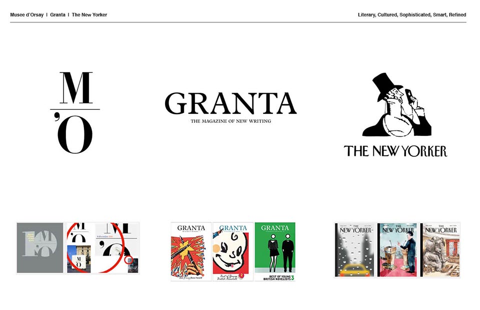

Since much of the design was centered around the idea of traditional magazines and journals, I wanted to take a similar approach to the new identity that honored many of those design traditions.
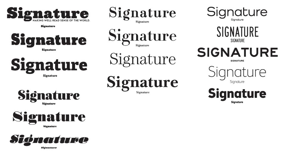
The first thought was a heavy slab serif for the wordmark that evoked older newspaper mastheads. Even though, the team experimented with several different styles of serif and sans-serif font types.
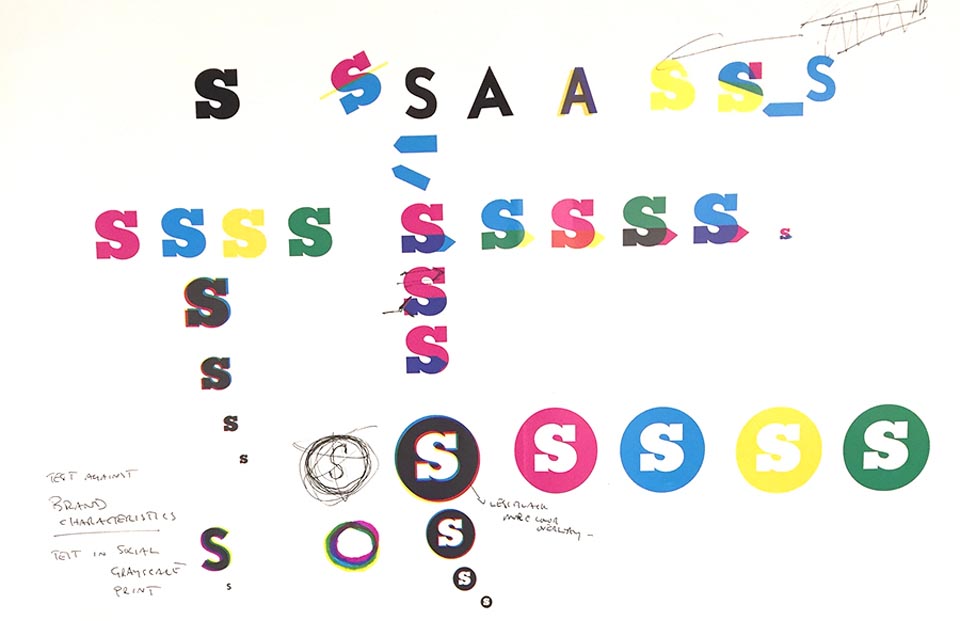
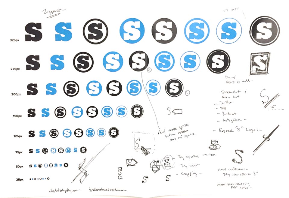
I began to play with the tittle of the “i” and developed a circular motif that was reminiscent of an old typewriter key.
The CMYK color palette followed along naturally as we wanted to relay the feel of an older, analog form of printing that was now living in a digital realm.
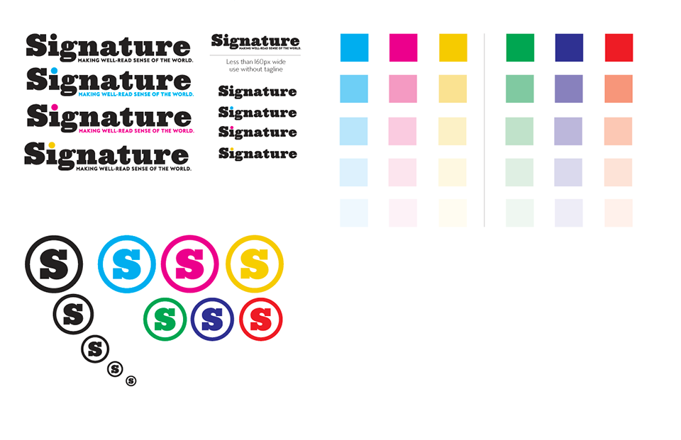
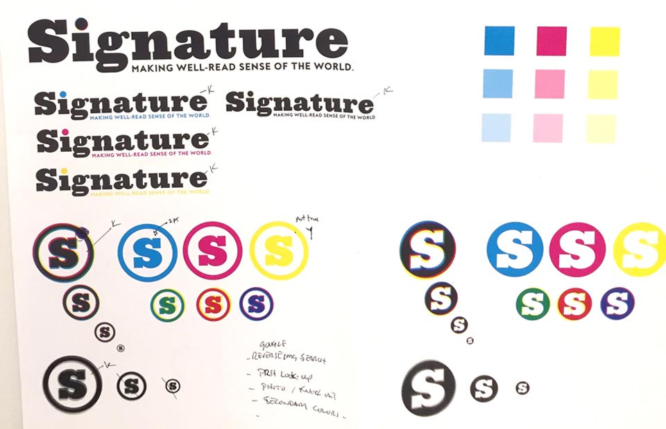
The final wordmark with tag and lettermark with Penguin Random House logo "lock-up."
The branding system with primary and secondary colors and the beginning of usage specs.
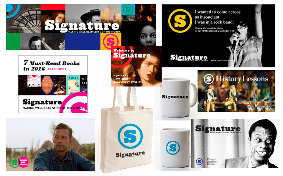
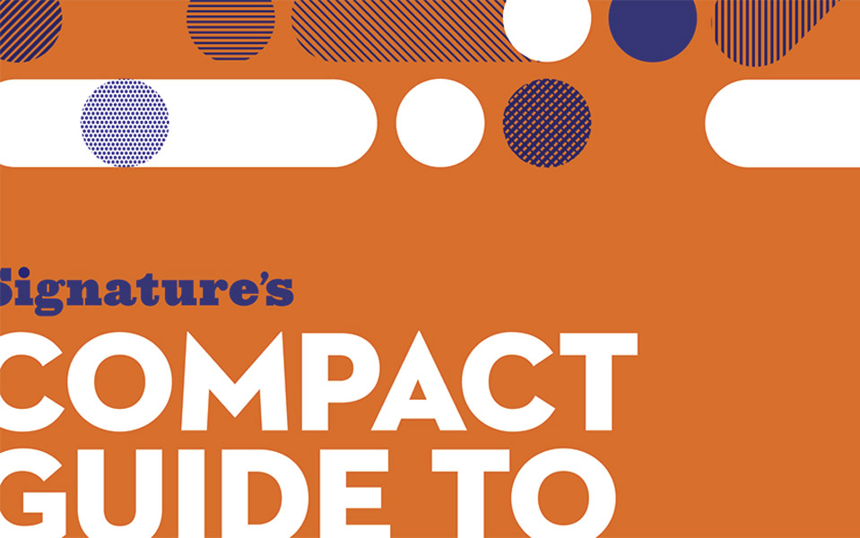
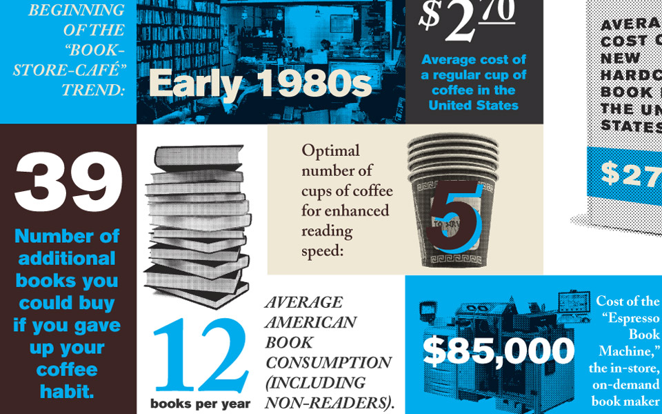
Our usage stress testing which also became the beginning of many of the promotional design templates.