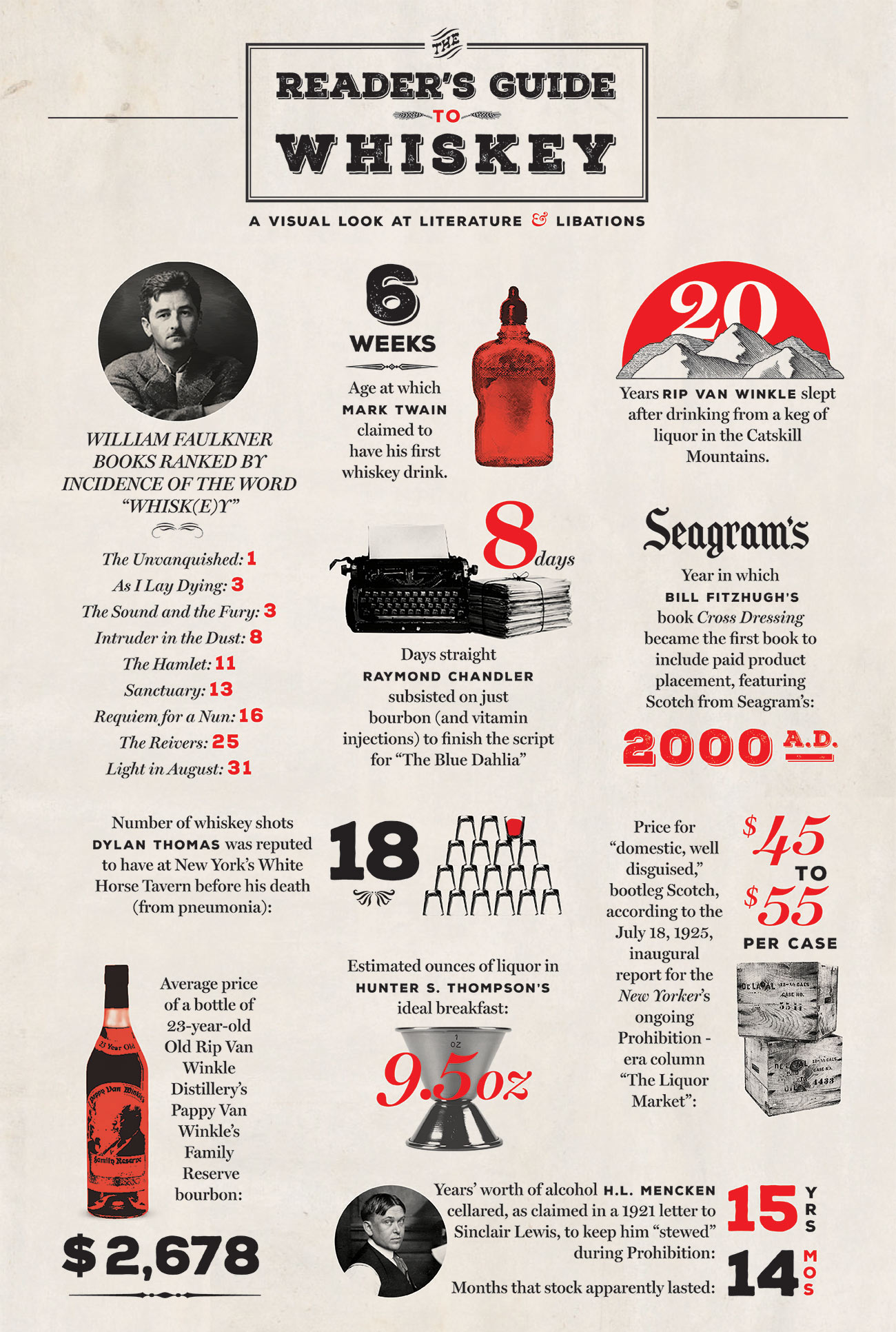
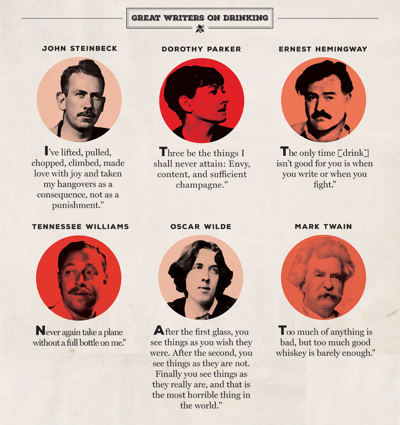
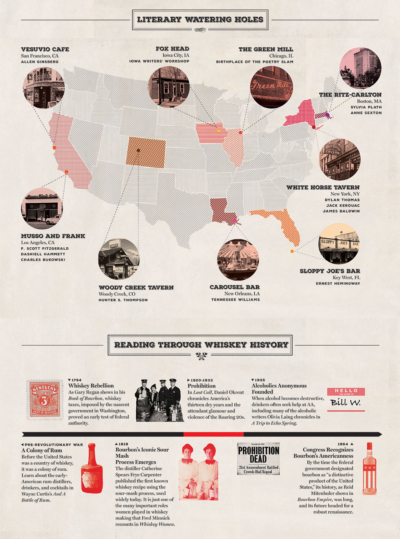
The first one was a whiskey tie-in. After looking over the content, it seemed that the tone was a bit more serious and writerly so I adapted a faded, historical, Southern feel. It felt like a whisky brand design for Bulleit or Blanton's thus the caramel, red, and orange palette.
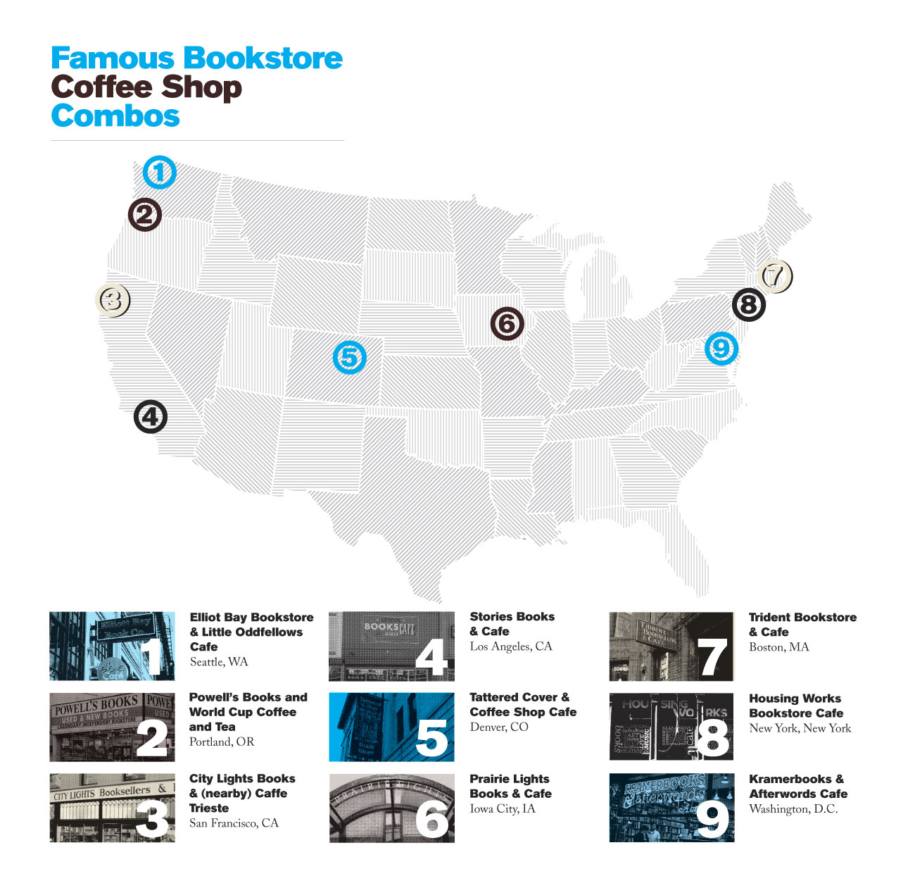
The map was fun to figure out but I must confess I really appreciate anyone who makes alot of these. They do take a bit of time.
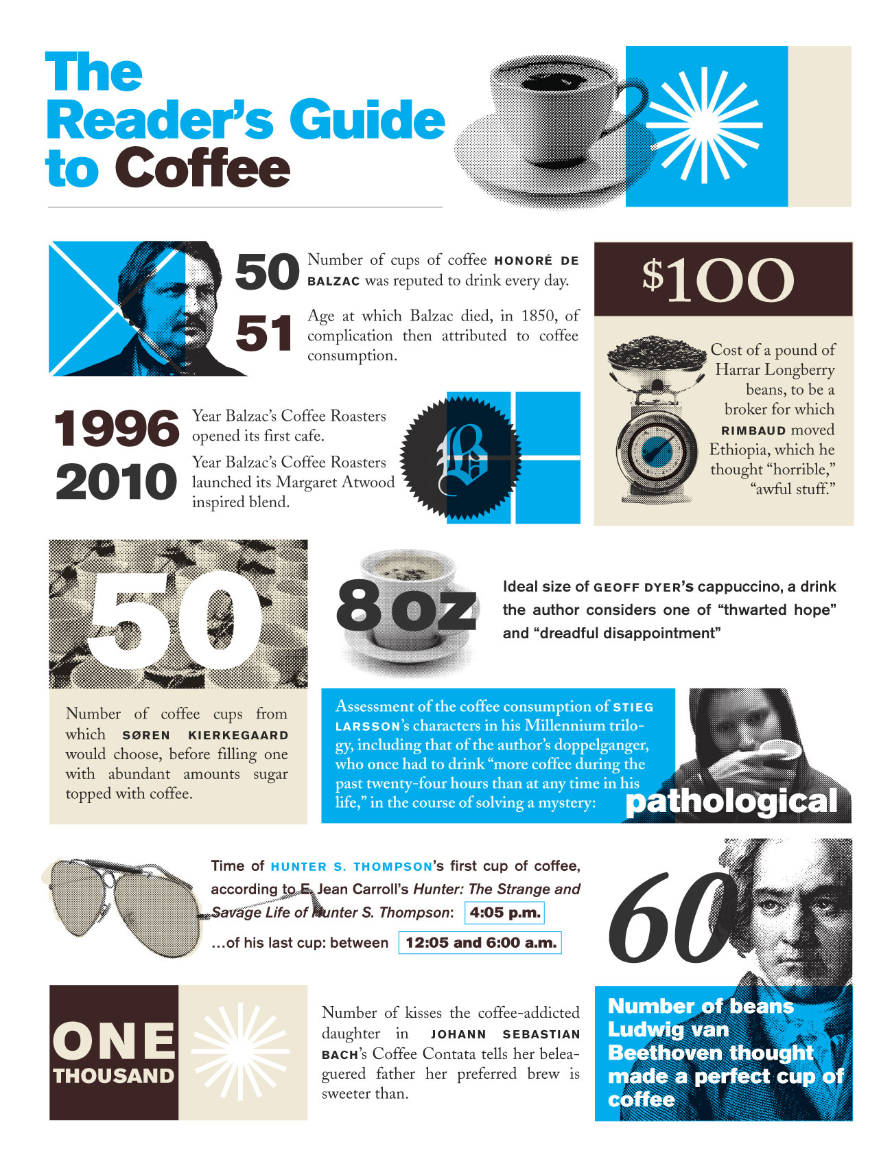
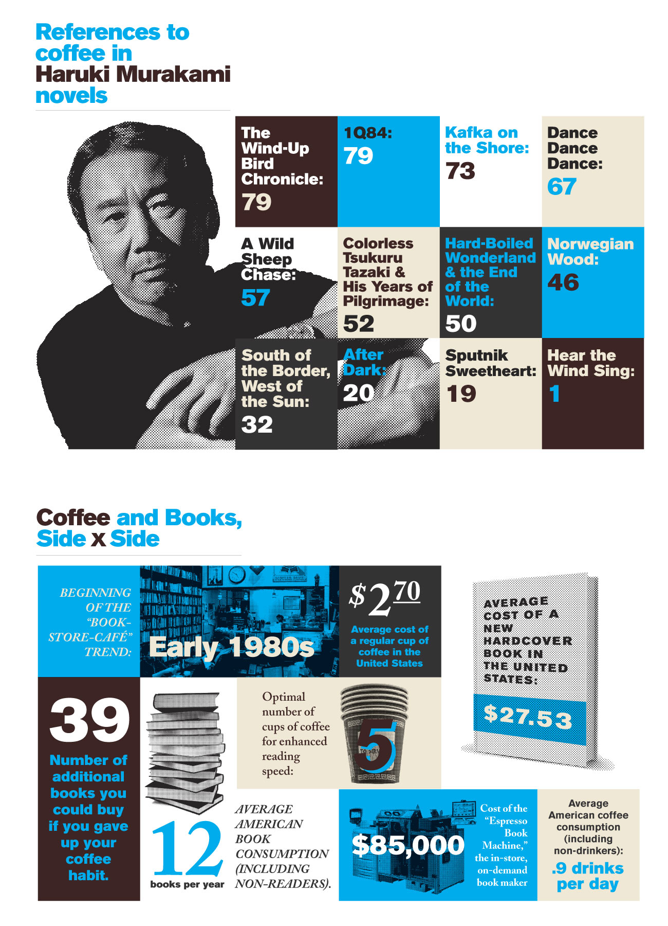
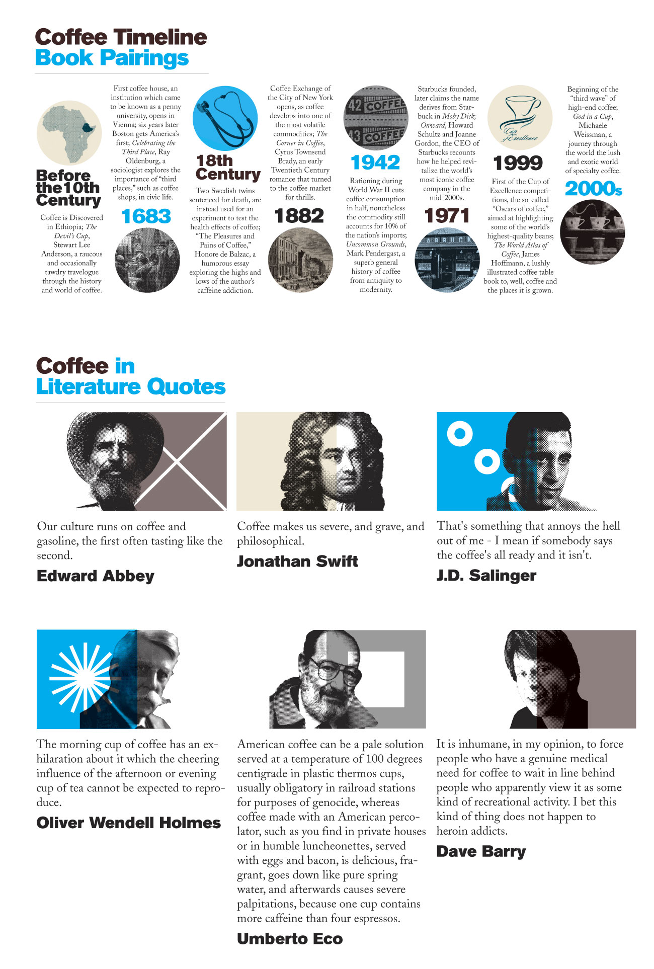
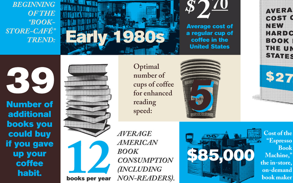
The second one was a coffee theme and was more up-beat. I thought about the heyday of coffee in the mid-century which led me to shamelessly employing a very blatant Eames visual style with the geometric symbol blocks and color overlays. I will admit, it was still fun but with the amount of work involved, the editorial team thankfully decided that it wasn't worth producing these on a regular basis in the long run.