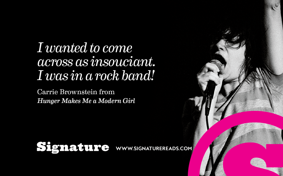
Signature
UX / UI / Visual Lead
Penguin Random House | 2016
The Random House marketing content and editorial team approached me about optimizing a post page template for an in-house marketing vertical websites named Biographile. The site was painfully outdated, underperforming and limited. But, before committing to a major redesign, they wanted to start with the post page to see if we could improve performance.
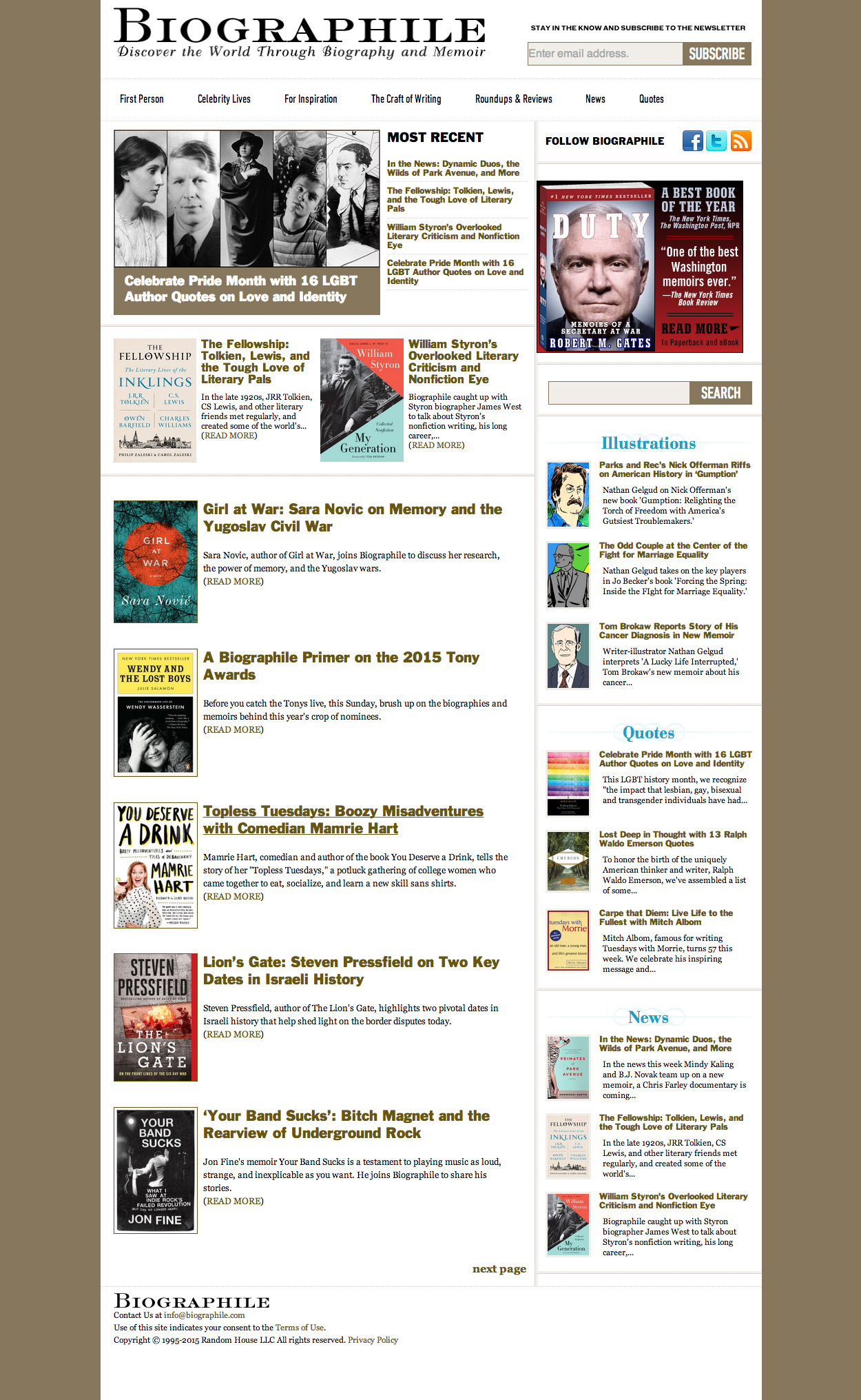
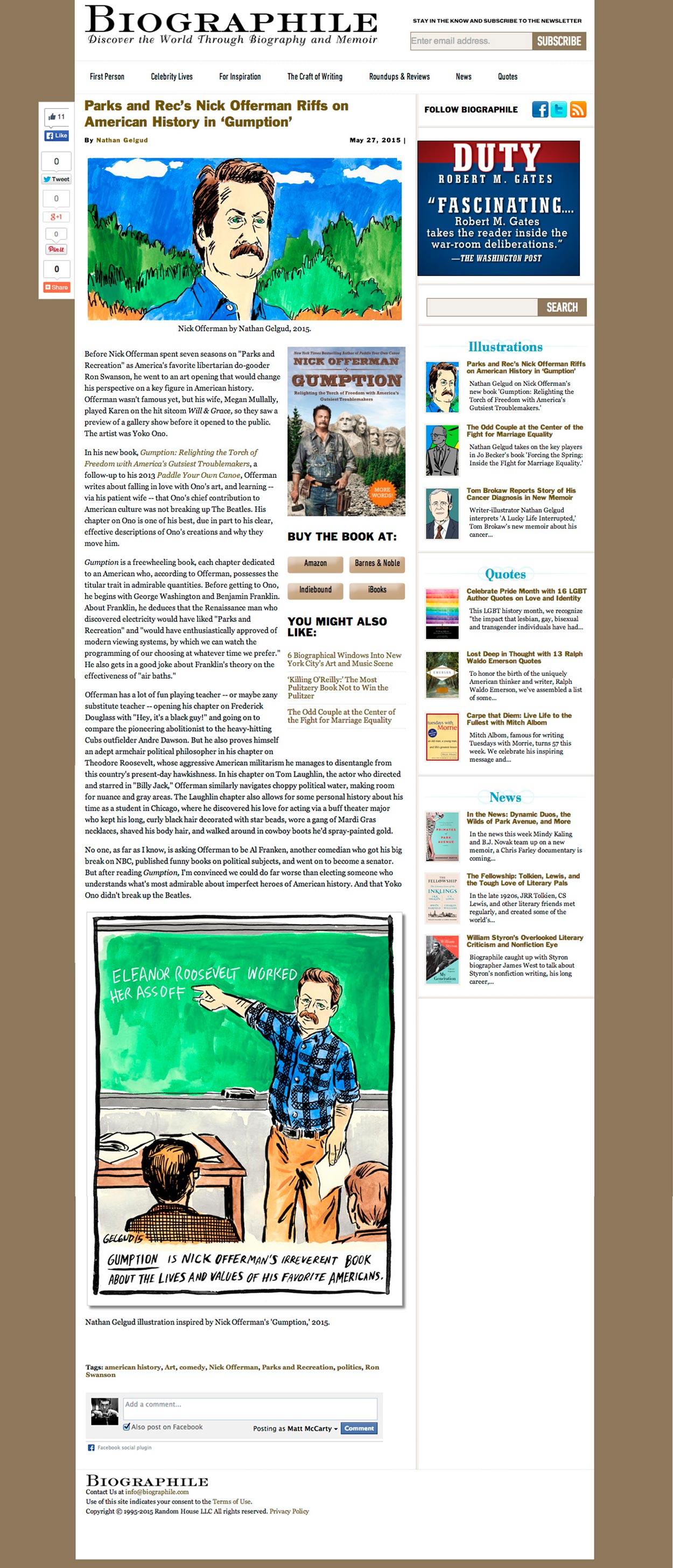
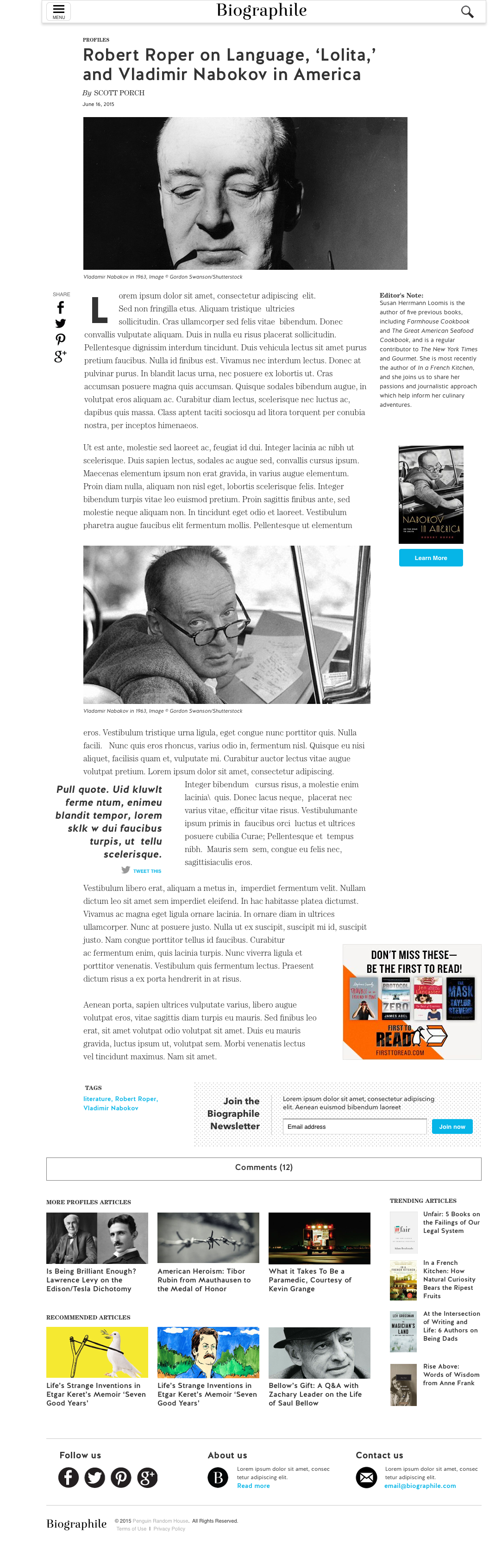
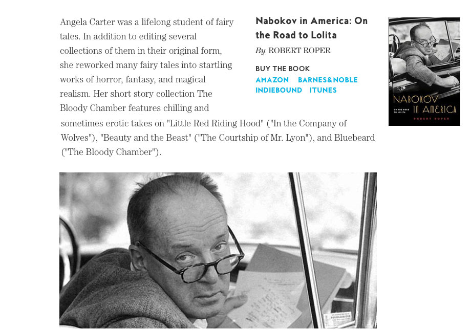
The original homepage and post page. The templates were very much the traditional blog style from its original design, roughly six years earlier—a tight content well with an overburdened right rail crowded with suggested content. You might notice that the newsletter sign up form is where the search form field typically would be and the search field where you might find a newsletter sign up area.
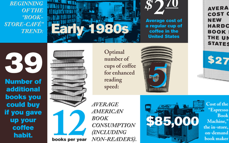
The tight column for the body copy coupled with some less than optimal font and color choices made the reading experience pretty poor which I felt was a shame as the site had some really nice long form articles.
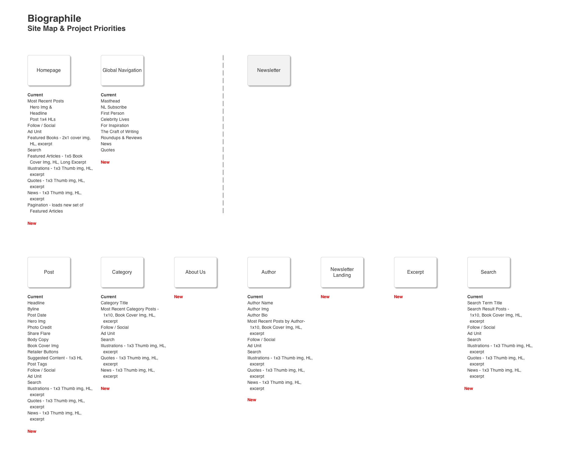
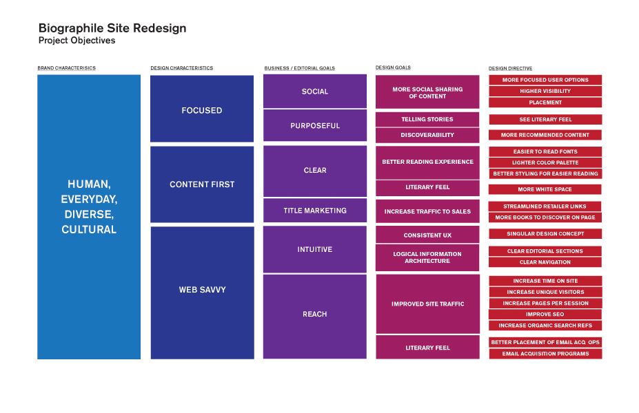
I started by getting a better sense of the site as a whole by breaking it down with a site map as well as mapping out the business goals to some very specific design goals.
Initial user testing of the site uncovered several issues: uncertainty of the site’s mission, trouble pronouncing the name, no clear paths to explore the site, and a very high exit rate after reading a post. The users liked the content but not the site itself. The project was quickly rescoped to a full rebrand and redesign of the entire site which became Signature.
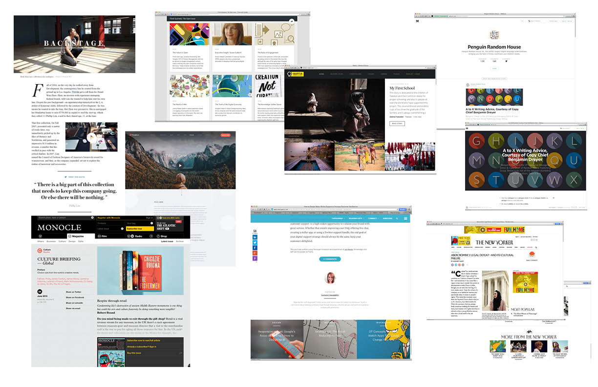
The mood board. I knew that we wanted to not only look like many of the great literary and cultural sites I was researching but also to utilize alot of the same user experience aspects, most notably how they served up great recommended content that was timely and relevant.
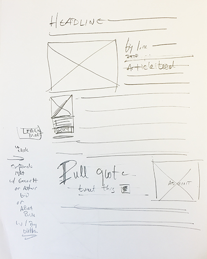
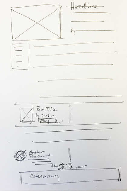
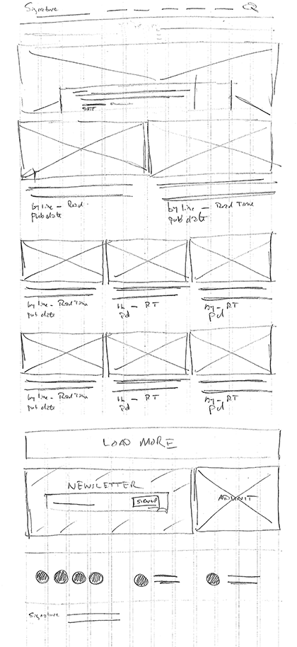
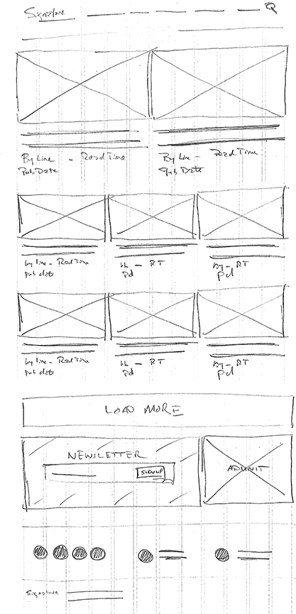
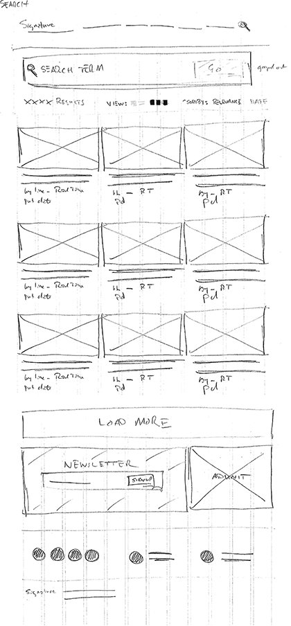
Early sketches of the post page along with a wire established pretty early on that ended up being the foundation of the page template.
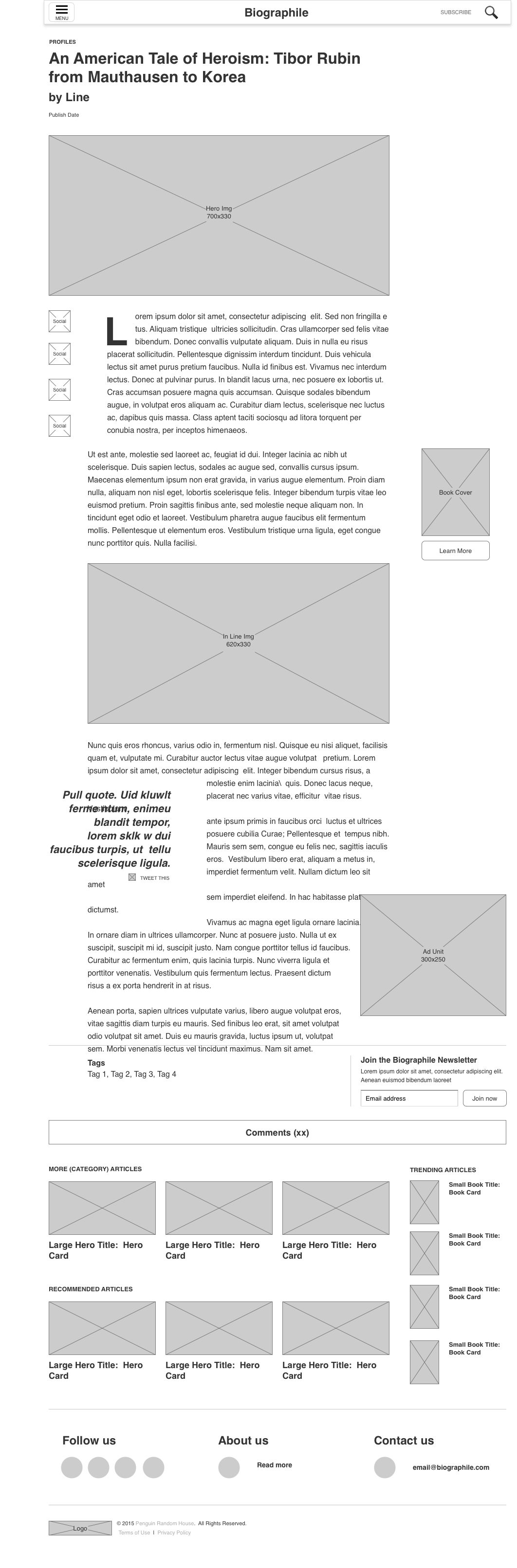
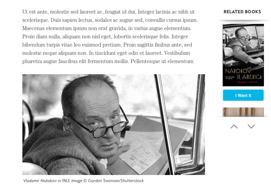
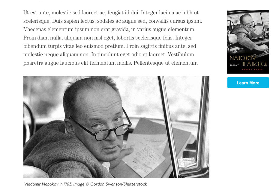
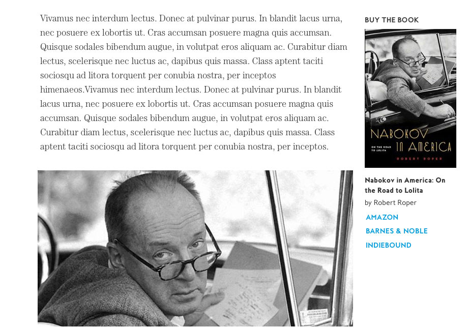
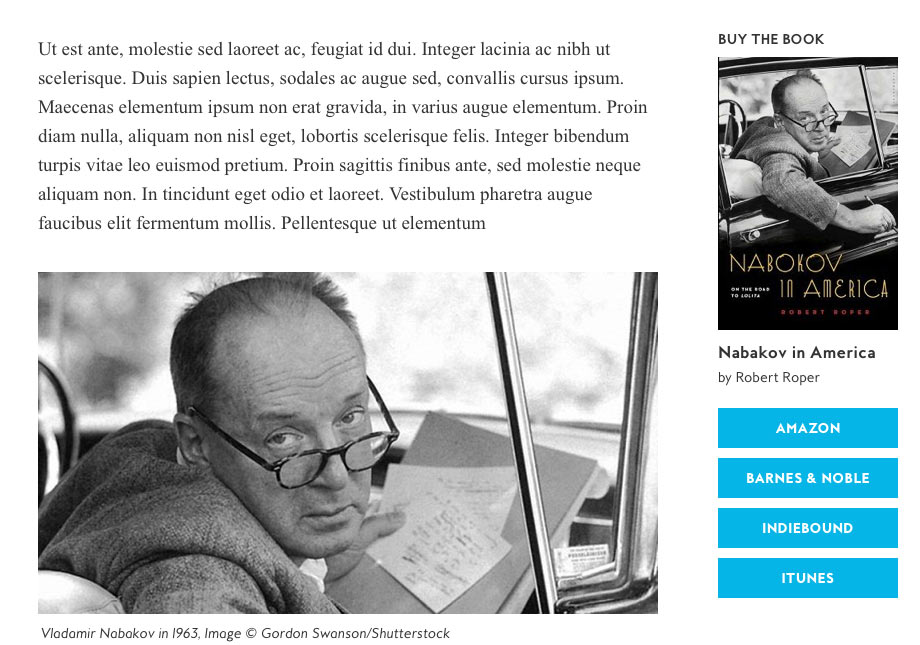
Here, iterating through a post page template. The working design with the old branding and then a finished post page.
We also needed to create some opportunity moments on the site—retail conversion, newsletter acquisition, related content discoverability—that extended a genuine value proposition for the reader and provided better support for some of our key business goals. The owners had larger business concerns like the site's ability to create a return on investment through better retail conversion.
Here, you can see the evolution of the book module. An early idea about allowing the user to scroll multiple books within the module itself. Through testing, we found this idea to be too unwieldy and unintuitive.
We tested this module quite a bit and found something new each time. A call to action above the book cover performed best. We tried different variations with the buy buttons themselves. Users preferred retailer buttons to be exposed as opposed to displaying a single Buy button that revealed more buttons. We experimented with links but buttons still performed better. The lower right image is the current design.
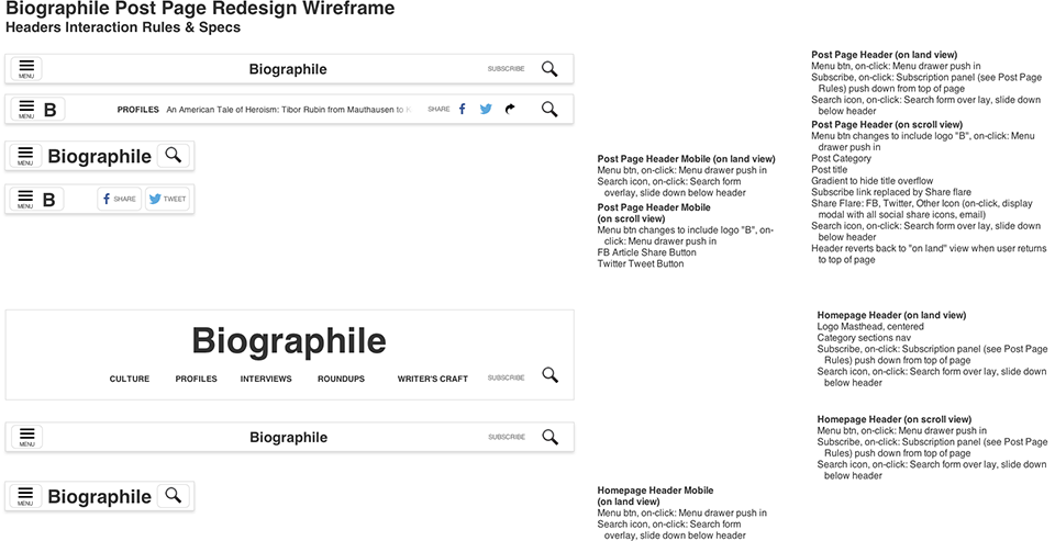
The header that changes states on scroll and includes social share. As was the early trend at the time, we wanted our site header when minimized to display the current article title as well as some social share opportunities. It was so new, we were looking at the handful of other sites that were doing it to figure out the coding but in the end, we created our own. Our developers didn't speak to me for about a week but after it was finished, they were really happy with it too. We were able to pass it onto other sites within our group as well.

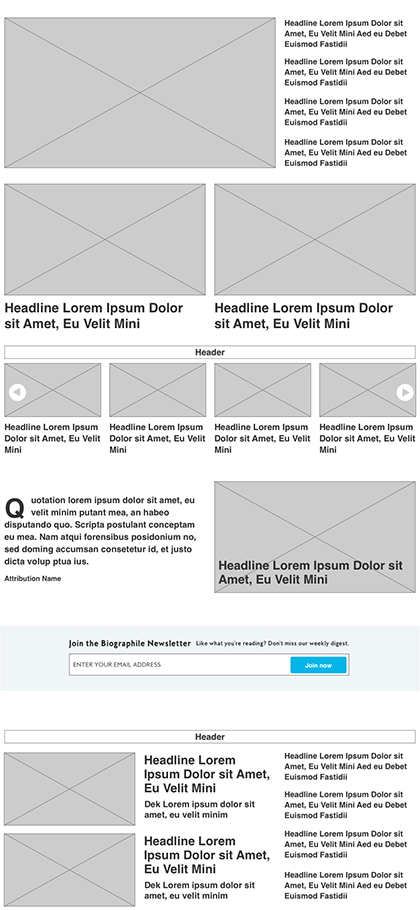
Since the site was a WordPress powered platform to be run by a small editorial team, I recommended we take a modular approach—building smaller visual components that would allow the editors to arrange different visual display modules according to their need. Pages could be built on the fly, and special editorial sections or landing pages could be created without waiting for design or development assistance.
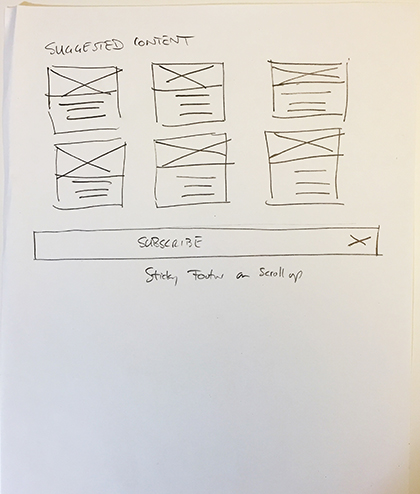
Sketches and wires for the homepage concept.
The modules. These can be arranged any way the business owner decides. The system was so successful, we simply established certain combinations of modules to create the remaining unbuilt pages like the category, series, search results, about and campaign pages. Once the modules were built, changing the design or creating new bespoke pages was really simple not only from a back-end, development perspective, but also from agreeing on a new design with the business owners as everyone shared the same design language and understanding.
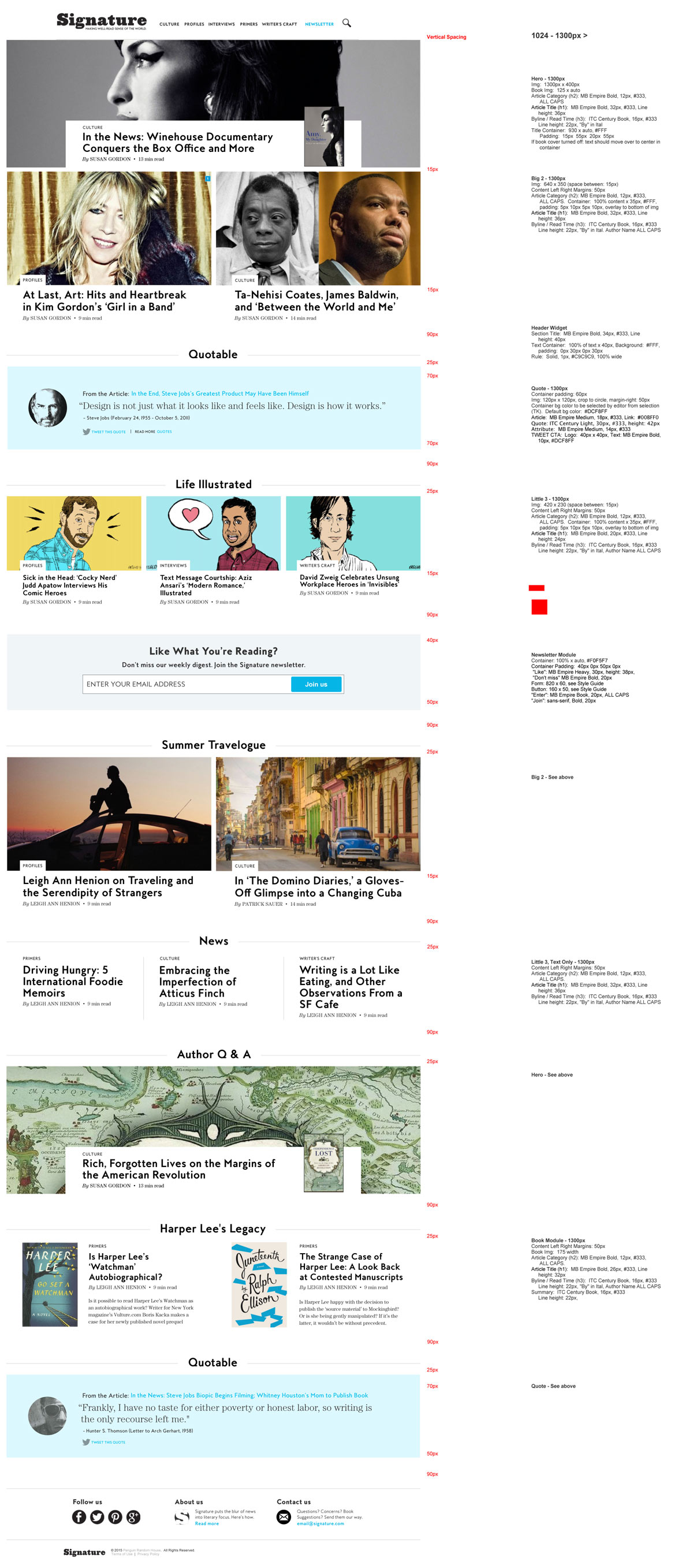
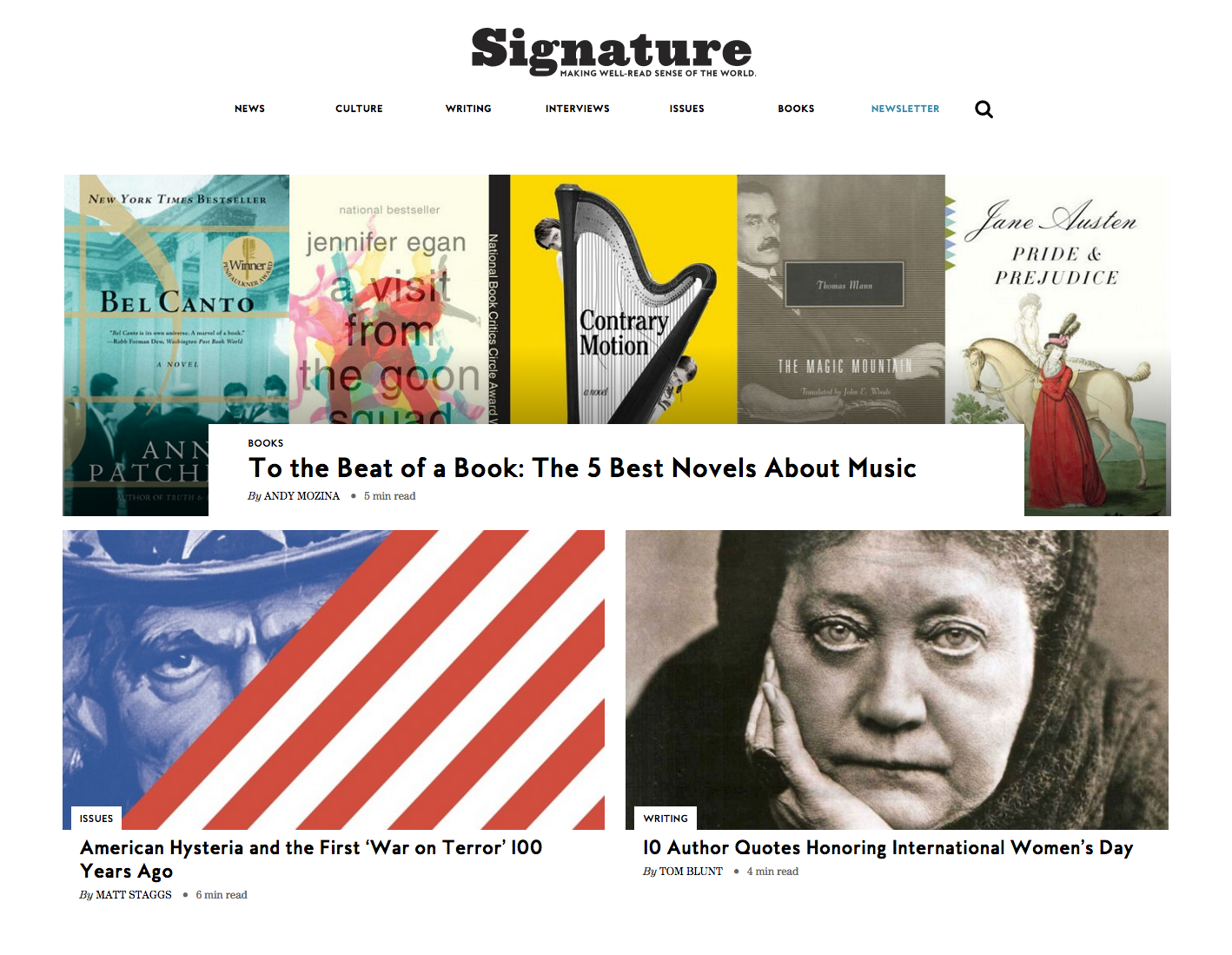
First, what we called the Big 3, a full container width module stacked atop two half container width modules. This is good for the top of pages or anytime you would want to denote a new section within a longer page.
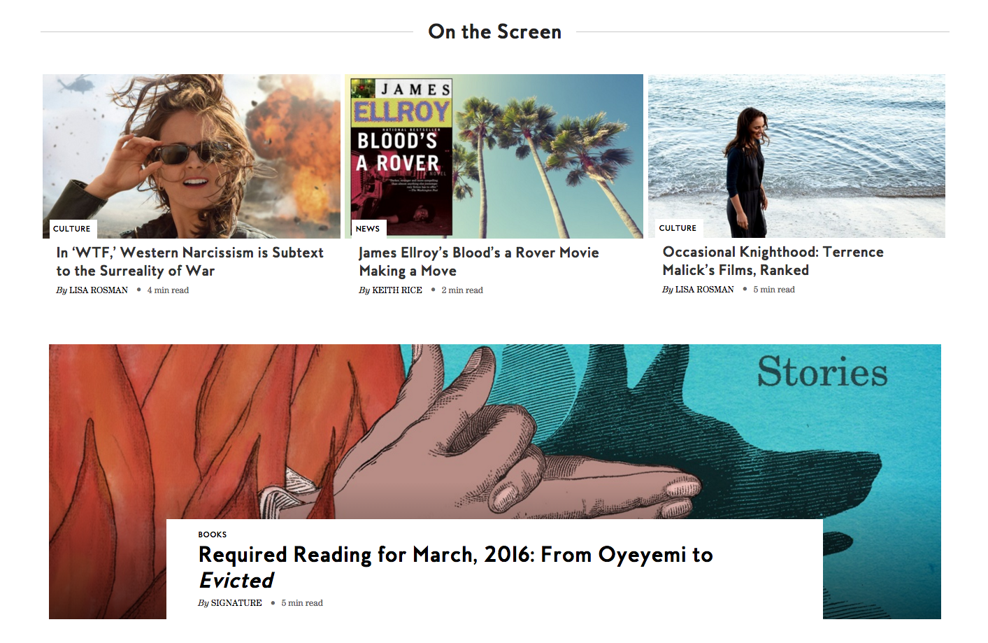
Next, a Little 3, three article containers within a single row span. Here it's placed above a full width module. We created separate Title Modules so the user could group and denote sections of modules by simply inserting it at the top of a desired section. Here it is with the caption On the Screen.
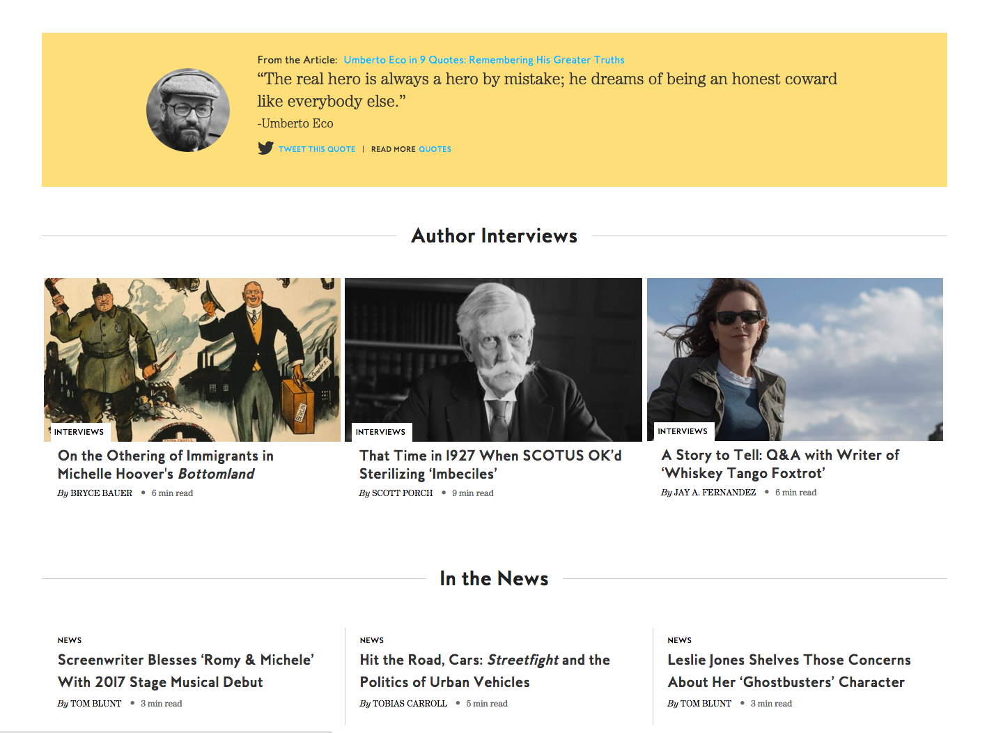
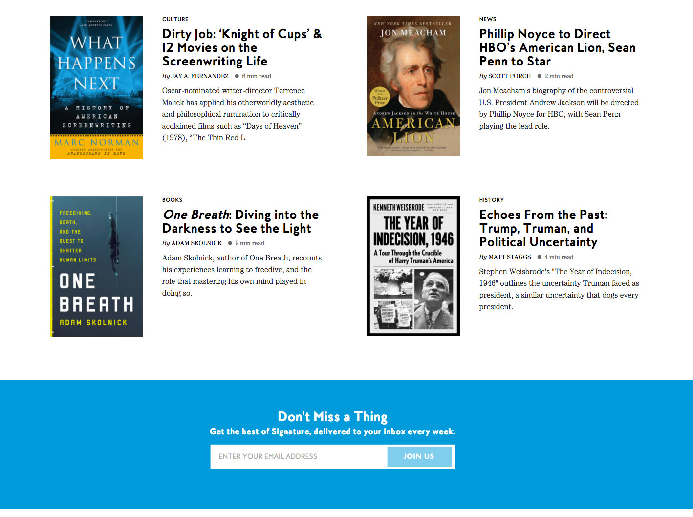
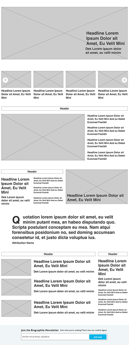
Here is the Quote Module to highlight pull quotes with an actionable share as Tweet functionality. Truth be told, the Tweet function is rarely used. We gave it a solid color background to help break up the page. It's on top of a Little 3 which is above what is called a Text 3 which, as the title suggests, is a text only variation of the Little 3.
And finally, the Book Module which allows the user to display two books in a row at a time. The module can be stacked multiple times to create a long grid of books as seen here.

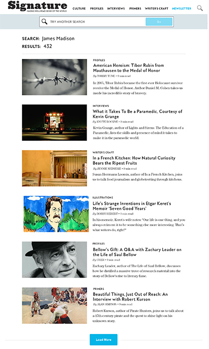
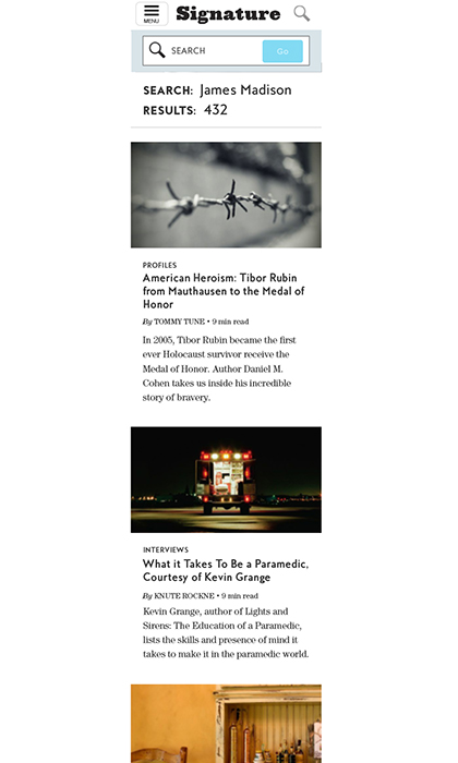
Sketches and final designs for the search results page.
Overall, everyone was really happy with the new site. User time on site nearly tripled in the first three months as well as overall traffic and pages per visit; retail conversions have climbed steadily from 2% to over 15% over the past year. Retail conversions are exceeding expectations with an initial 150% improvement and have now settled into the higher end of the industry standard at about 7+%.
Signature has now become the template for how all of the Penguin Random House marketing verticals are built and a 2018 Webby Award Honoree for Best Cultural Blog/Website.