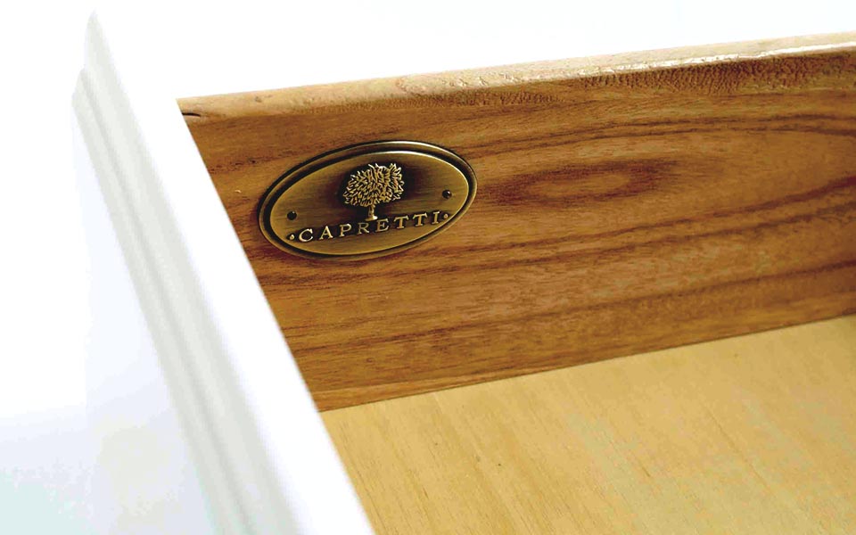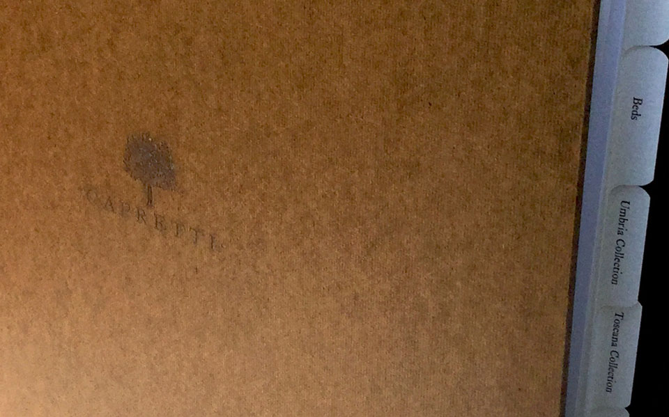
Capretti
UX / UI / Visual Design
National | 2006
When the nascent children's furniture company Capretti came to me to create their branding they asked if I could also build them a website. At this point in my career I had only created a couple of sites that were pretty much digital catalogs or showroom sites. I had no experience with any kind of online retail which was a requirement for the build.
What strikes me most looking back at my old files for this project is how little documentation there is. My approach was purely visual and I went straight to Illustrator and treated it like it was a magazine page layout. No user flows. No sketching. No wires. I went visual first and figured once I had a template I could wire all the pages together. I knew how databases drove and populated these kinds of sites but had no idea where to start.
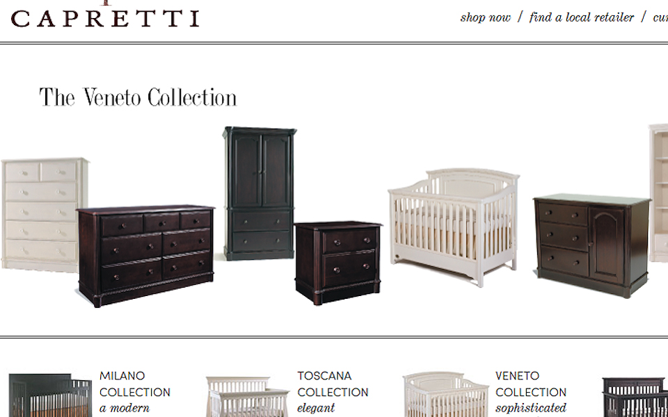
Here's an early pass at the homepage. I was hoping to introduce a pattern element for the website to help give it some additional color and texture. I was already tinkering with adding an additional font to the established sets I had just created for the branding. Too much tinkering. That was a hard learned lesson early in my career: Once you have it established, leave it alone.
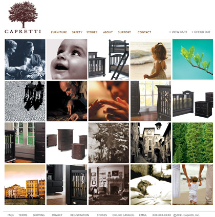
I began playing with another new element, an image grid. We all agreed that it was too cryptic for those visiting the site for the first time and obscured the furniture which should be up front from the beginning. I then began paring things down.
At the end of the day, I got pretty lucky surviving on instinct and good feedback from the business. We also had a really good pool of family friends, investors, and even a small group of ideal customers to show things to every step of the way. I had done some group / focus testing for my branding work but it was all held toward the end of the process. This project is where I really learned the value in user testing at as many steps in the process as possible.
You can't see it here but the rows just below the main image were automated slide shows. My first foray in javascript. It took hours upon hours but I finally got there once I managed to de-bug the thing.
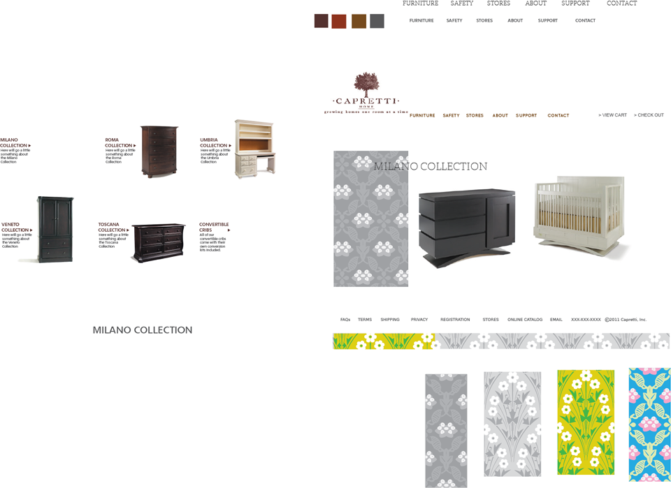
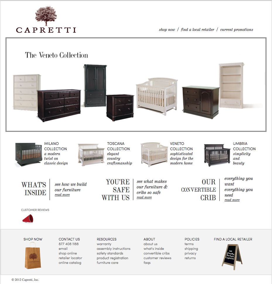
Here's the category page. Another invaluable lesson learned on this project: information architecture. If the information isn't arranged and displayed in a logical, predictable way, the user is completely lost.
I also figured out early in the construction that their needed to be persistent elements on every page that allows for the user to explore other parts of the site that might be of interest. Consistent display and maximum relevance are key to keep the user engaged and moving in a meaningful way.

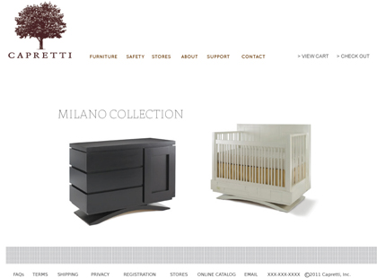
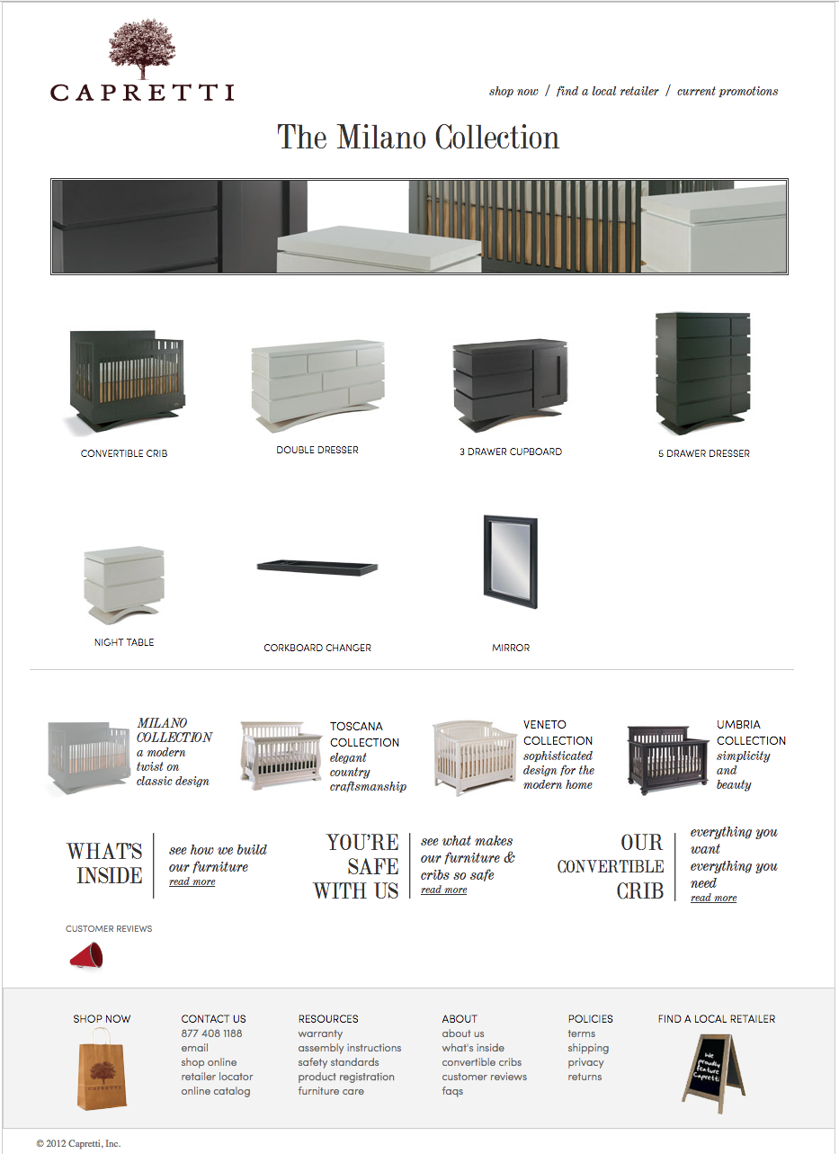
The product page. I think I studied hundreds of product pages not only for furniture but any kind of similar product or market that might tell me something to help optimize the page. Since each individual piece lived within a larger collection, I wanted to make sure the user could browse to see how it all fit together so I introduced a smaller nav element below the product info.
Looking back, I would definitely chastise this designer for combining two vastly different purchase actions (Buy Now or Find a Retailer) within the same button element but you learn as you go.
The Buy Now button was wired to a Shopify shopping cart that we were able to skin well enough so the experience was fairly seamless but still transparent enough to let the user know what was happening. Shopping carts and online retail transactions were so far out of my ability but I did learn how third party services can easily plug into your site with some planning. It ended up working for all involved as the business was equally not equipped to handle maintaining their own retail system.
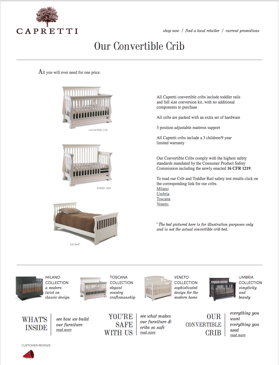
The business had alot of requirements to fit in on each and every page. Children's furniture is heavily accompanied by all kinds of government required safety warnings and information as well as general consumer education especially with cribs and beds. Thus, there are several touch points on the site that lead to different types of informational pages. Here is a description of how convertible cribs transform into beds.
The site ended up being over one hundred individual html pages with each and every bit of data hard coded into each and every page. It was an exhausting build and certainly eye opening as to the realization, There has to be a better way!. Shortly after, I started to educate myself on the way retail sites were built best and how to design with databases in mind. The world of opportunity opened up after that.
In the end, the platform was too much for the business as they eventually switched to a templated site that was easier for them to maintain. This was my first real lesson in understanding the need for scalable platforms that can start small and grow with the client.