Tastebook Bookstore
UX / UI / Visual Lead
Penguin Random House | 2015
Tastebook was a culinary recipe site and marketing vertical purchased by Random House as a way to create exposure for Random House cookbook authors.
The business owners wanted to test selling cookbooks directly on the site through third party re-sellers (Amazon, Barnes & Noble, etc.). The major constraint was that the site needed to be fully automated since there were not sufficient resources for day-to-day site management or maintenance.
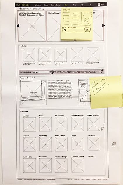
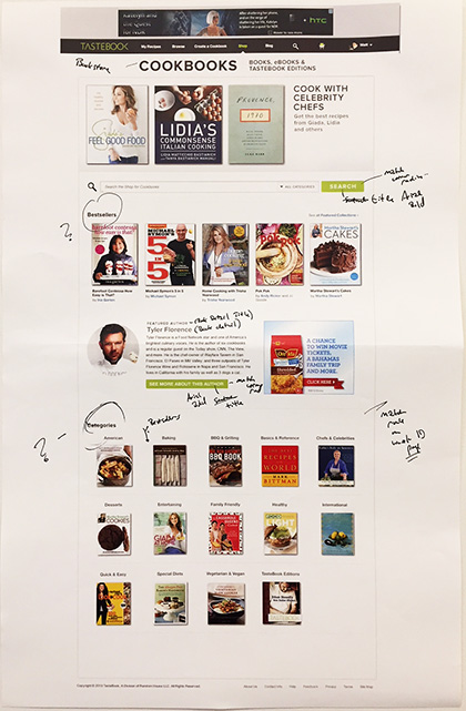
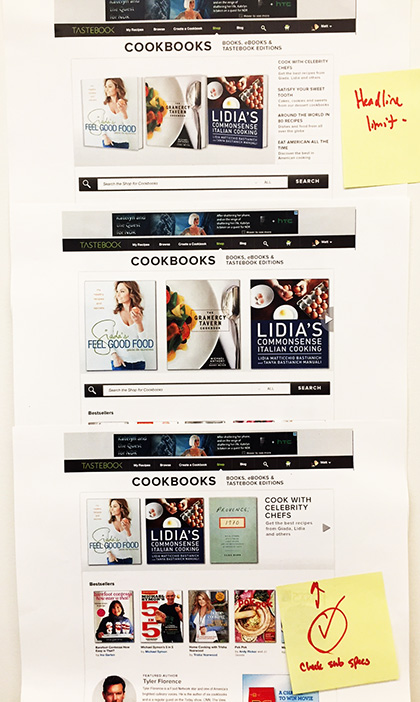
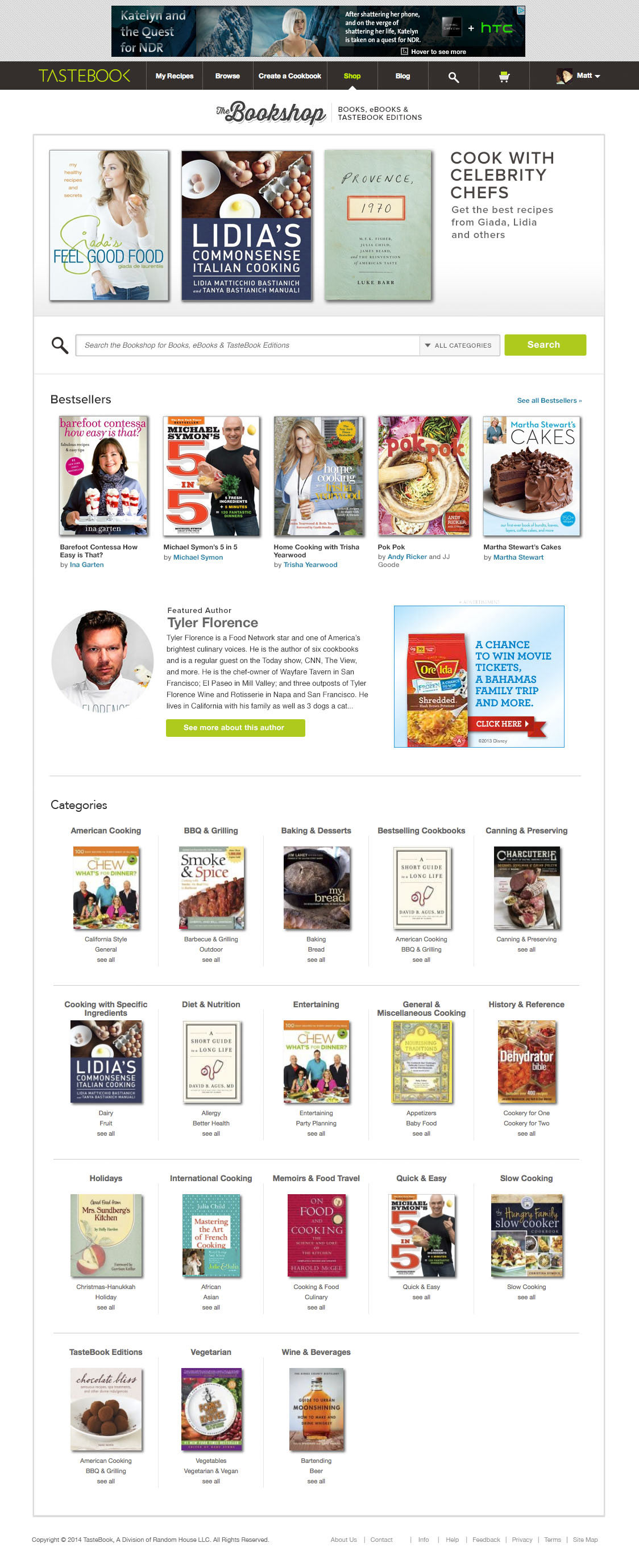
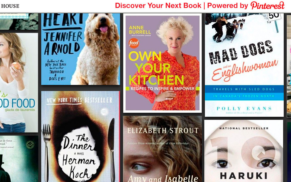
After consulting with our database engineer and our developers, I proposed a site that would be self-sustaining through a weekly automated update of book title information from our in-house database feed. New titles would be added across the site through an upload and cross referenced with sales information to create data generated categories like Best Selling and Most Popular. To give the site curatorial control, I designed two manually updated sections on the homepage (a hero section that featured seasonal cookbooks and a highlighted author section).
Here, wires and notes for the homepage and early prototype that was pretty close to the final design. Iterating the homepage’s top featured book section, trying to decide between a static display, a carousel or a slide show. And, the final design.

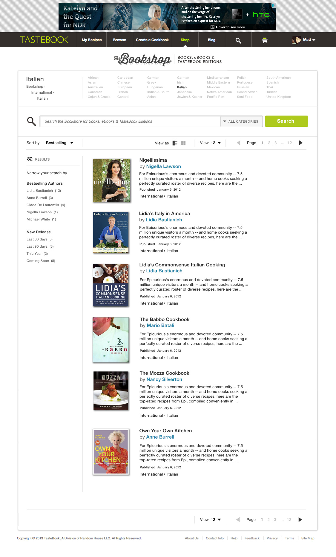
While being an automated site, I still wanted it to feel just like any other online book shopping experience which included a solid information architecture and expected functionality like a helpful search and filtering UI.
Cookbooks are especially tricky since different types of users search for books in one of three ways: Author, they have a specific person / chef in mind. Specific title, they know what the name of the book is but aren't sure where it might be located on the site. Or, most commonly, by category.
Cooking category carries its own difficulties since there isn't universal acceptance on the usage of terms. Some are based on region such as Italian or French but not all books fall neatly into those categories. There is also the matter of types of food: Desserts, baking, appetizers, cocktails, vegetarian just to name a few. There is also the tricky issue when a single cookbook might crossover between multiple categories. For example, a cookbook with both Italian and French recipes that include only appetizers. It can make you want to pull your hair out.
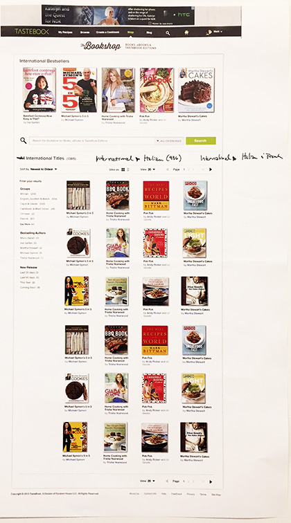
So, the ease of visibility, the language used, the information organization are all key factors for how successful a book site will be. Here you can see sketches for the category pages as well as an early version of the filtering UI. I played around at displaying the book categories at the top of the page instead of on the side. It didn't test very well.
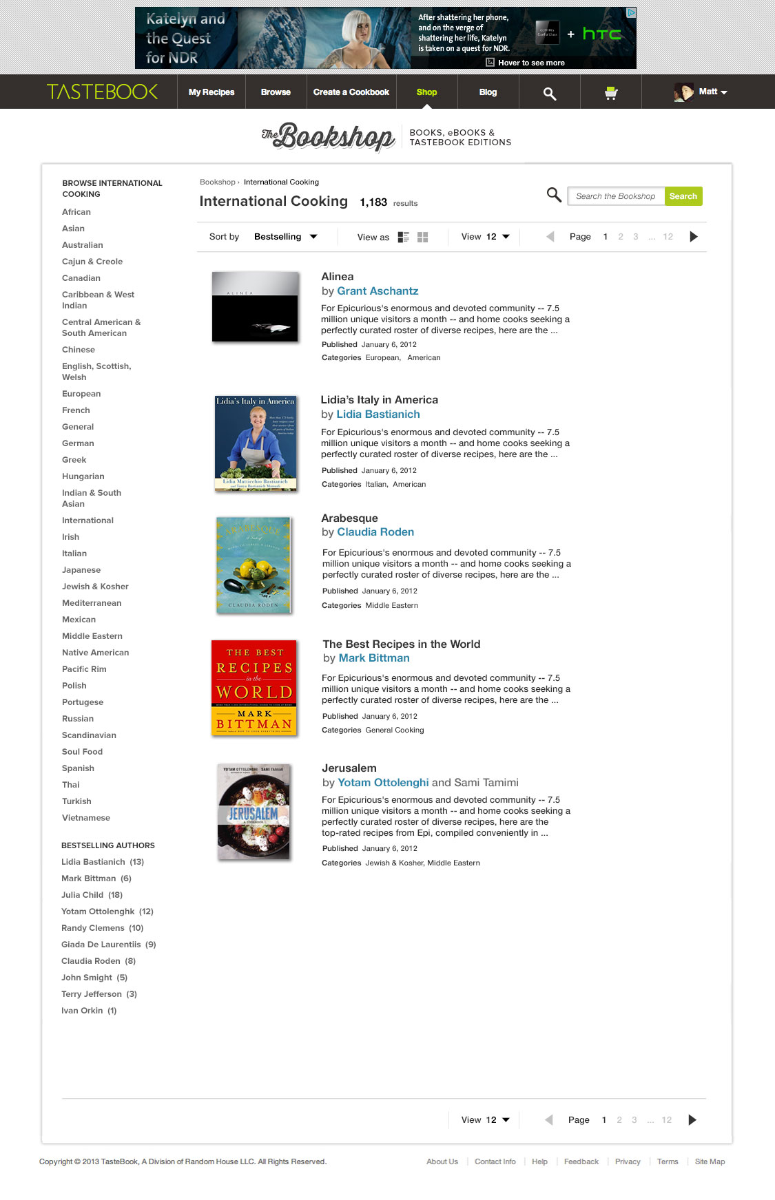
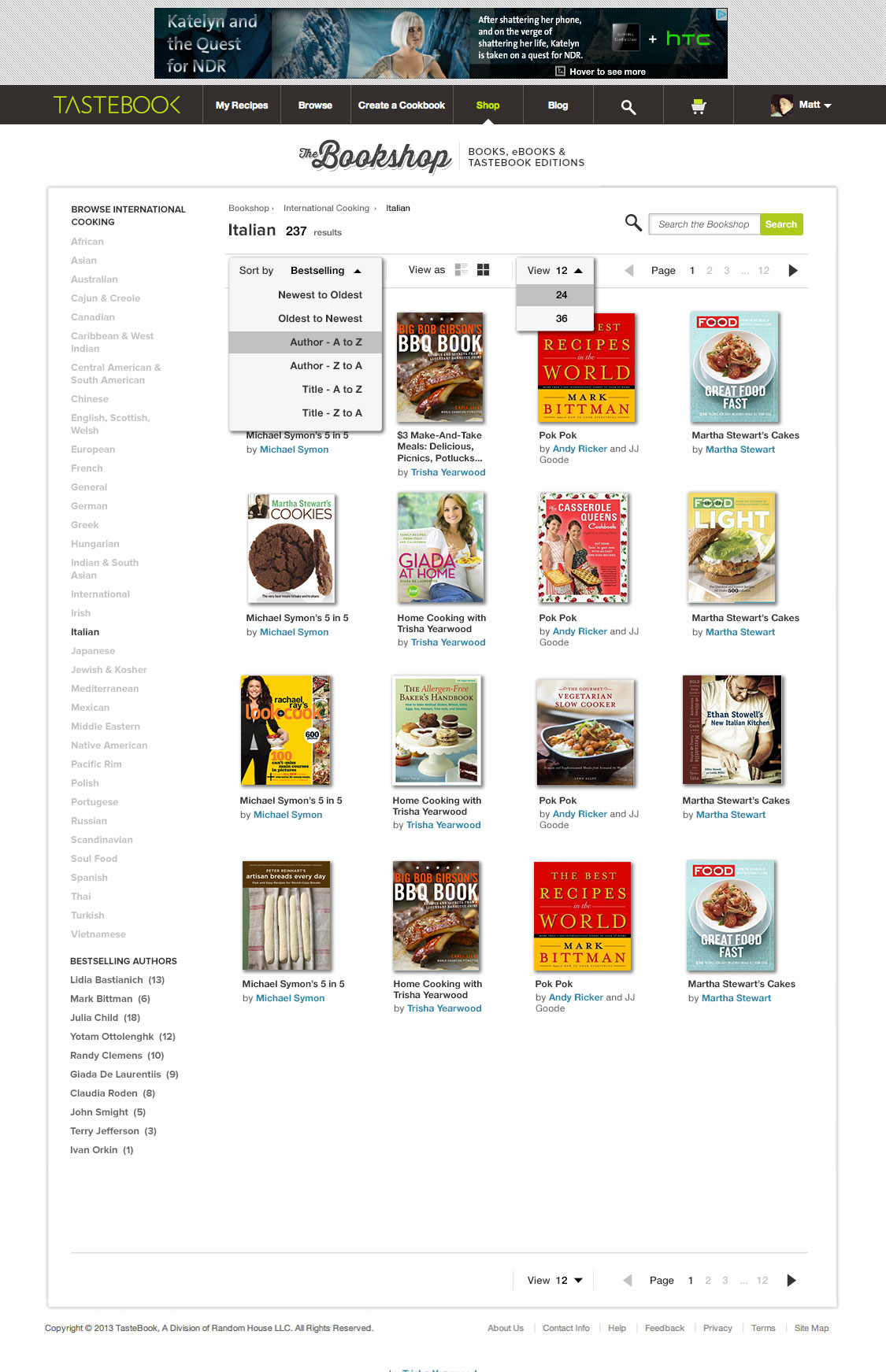
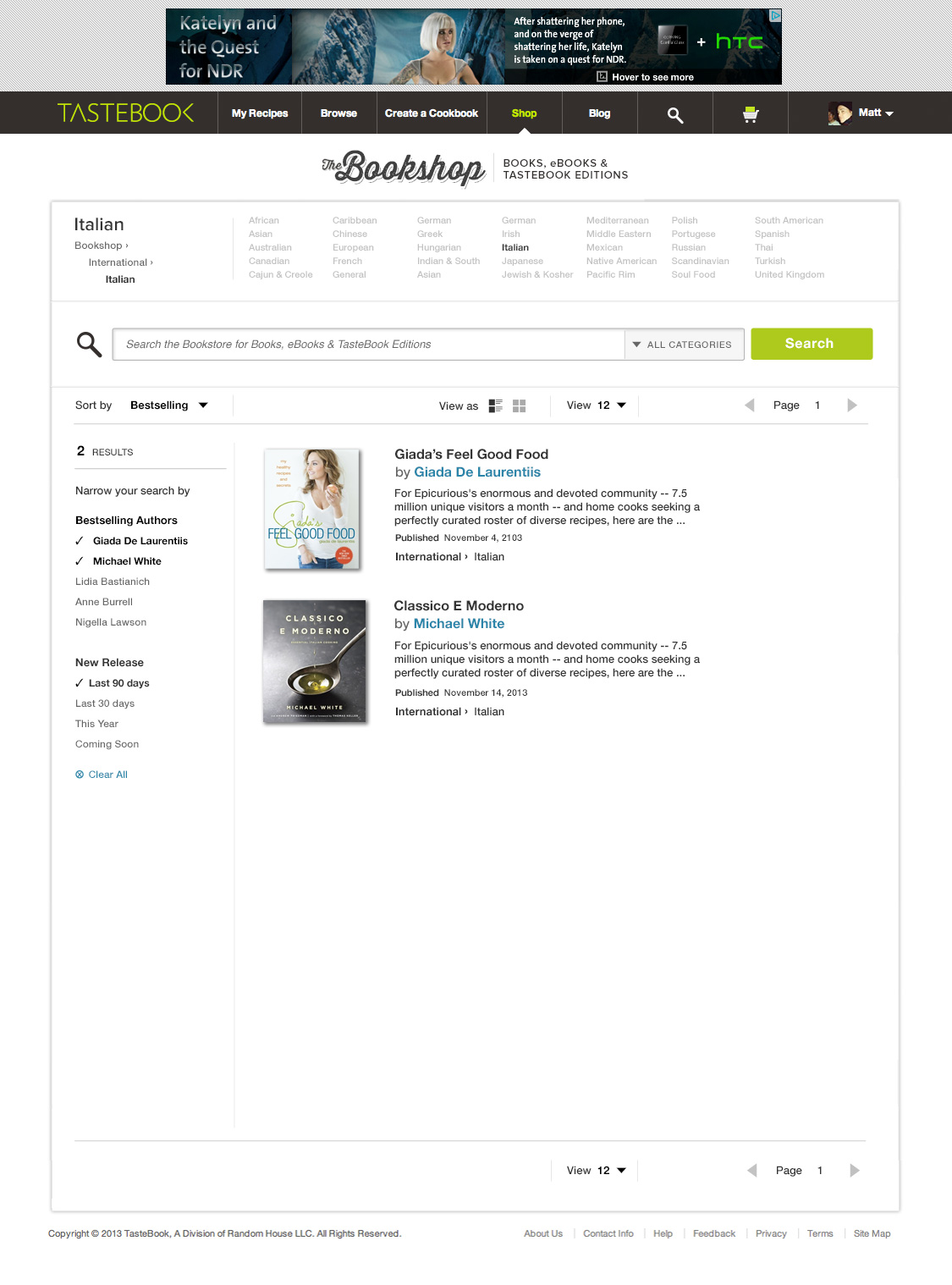
Here, final designs for the filtering UI. You can see I abandoned the categories at the top of the page design for a more traditional left rail approach.
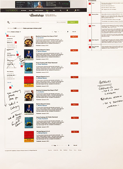
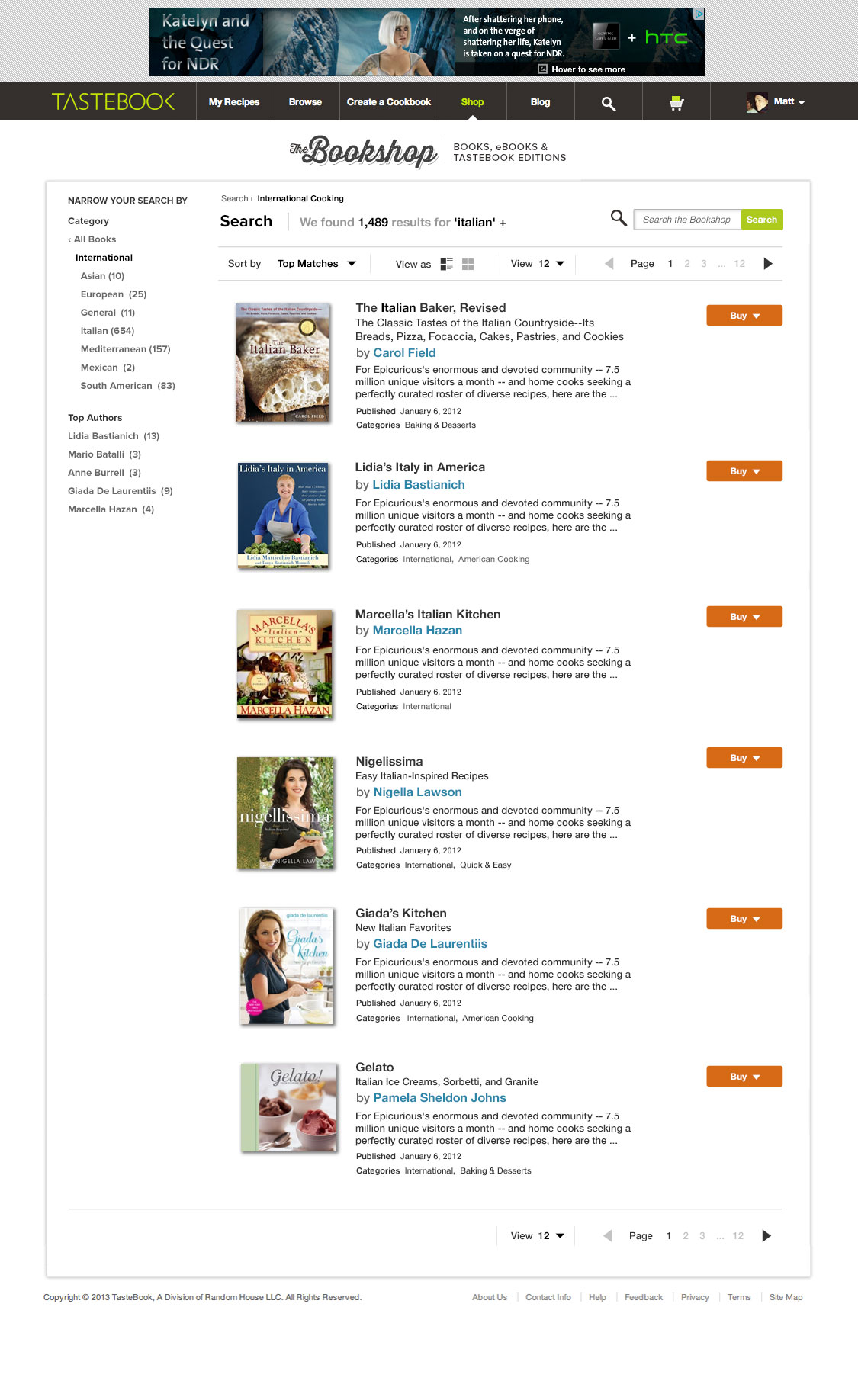
The search results page. I had an idea to test whether users would buy a book directly from a search results page. Why make them click through one more time when they've essentially found the book they were looking for? It worked. We had around a 4% conversion rate on the page compared to a 6.5% rate for the product page.
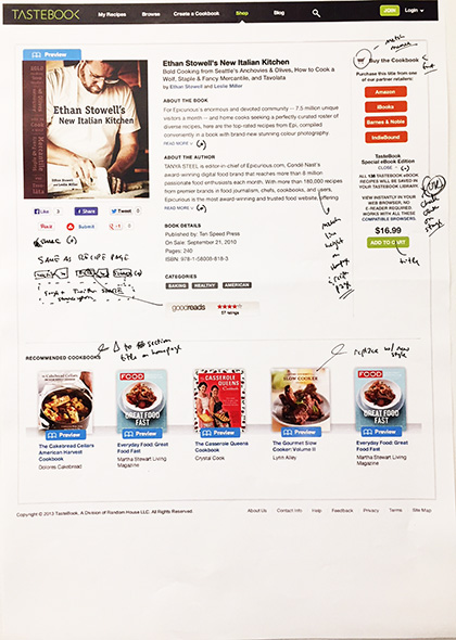
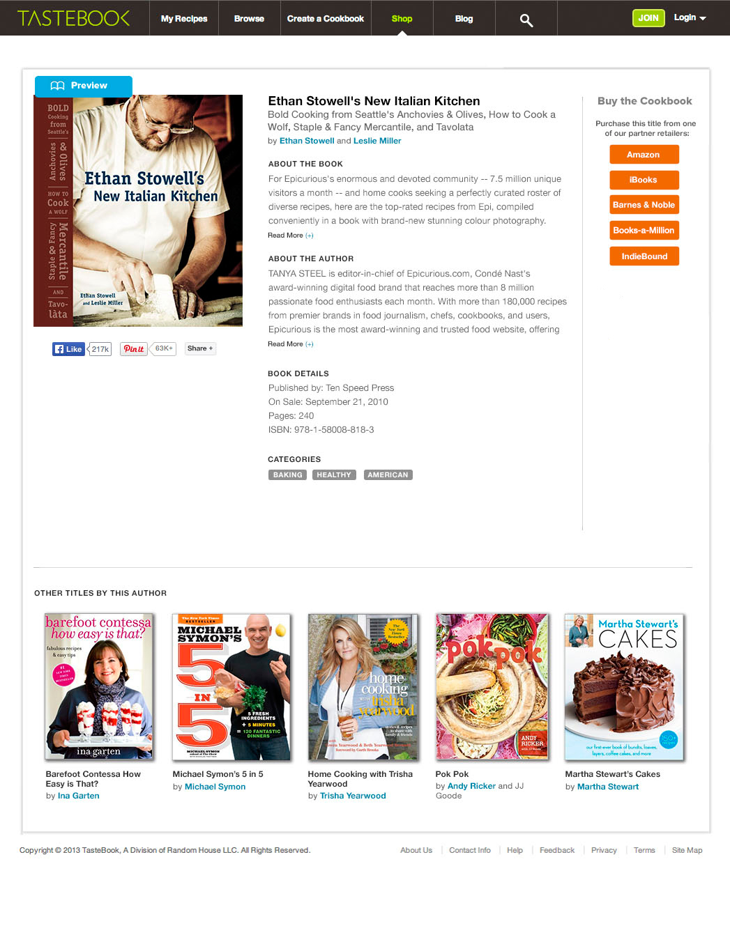
The product page. As I mentioned above, this page performed pretty well. Around a 6+% average conversion, which outperformed the same books on the Random House sites and 2 points above the industry standard. There was the ability to sell e-books directly from the site but we abandoned that idea as I felt like it was too confusing for the user at the key purchase decision point especially with all of the education needed in order to explain the differences between the two.
We completed the entire project with one designer, two developers and one database technician in under eight weeks. The site has since been spun off to another division that has rebranded it as an editorial only content site called Taste.
