Capretti
Branding and Design
National | 2006
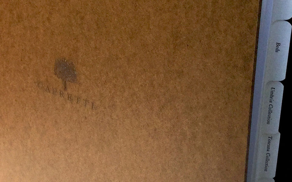
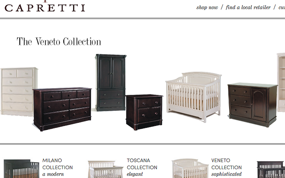
Capretti approached me to create the brand identity for their new children’s furniture company. This project allowed me to expand into all aspects of brand creation with a strong emphasis on voice and continuity that ran through all customer touchpoints—packaging, user manuals, catalogs, website and care instructions.

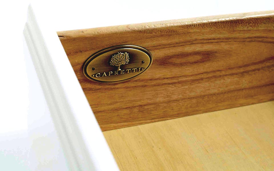
The owners really wanted to convey the feeling of a traditional, long-lived company but being brand-new had nothing really to draw upon. They also wanted to stress that their furniture was hand-made, piece-by-piece. I also needed to bridge those concepts with the fact that this is furniture for children which has an entirely separate set of market principles. I selected the image of a large sturdy tree to imply roots, structure, and an old-world traditionalism. As a complementary note to weave in children, I added a bird element to imply a place of safe keeping.
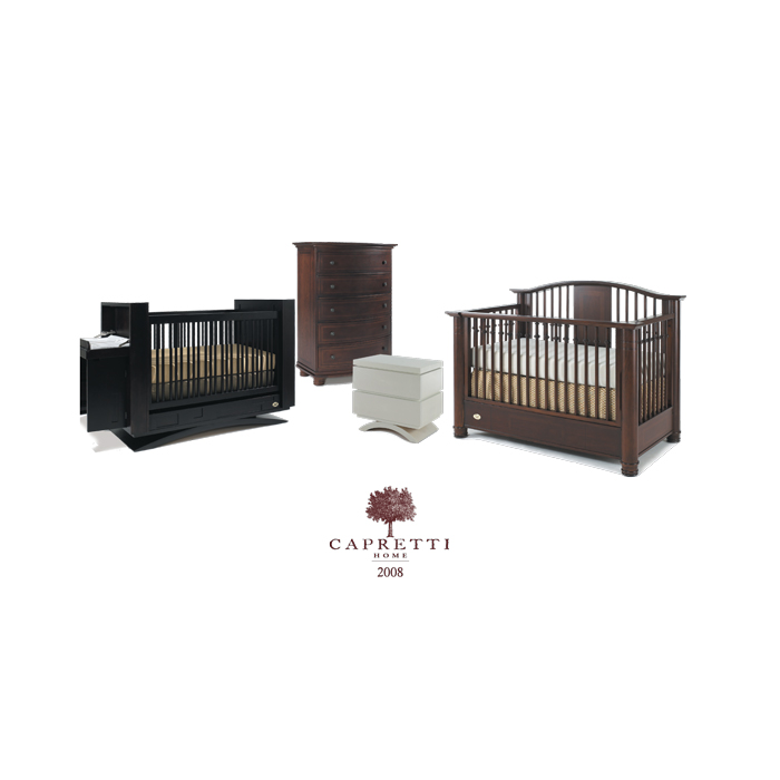
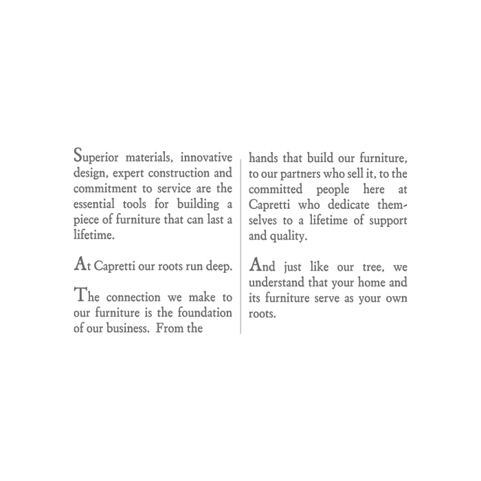
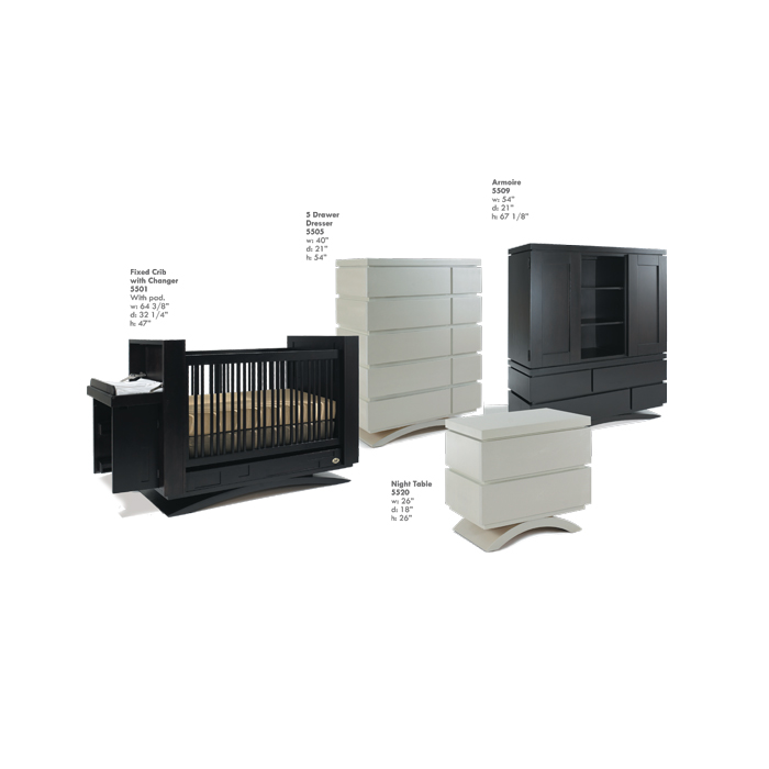
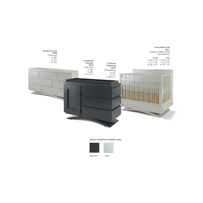
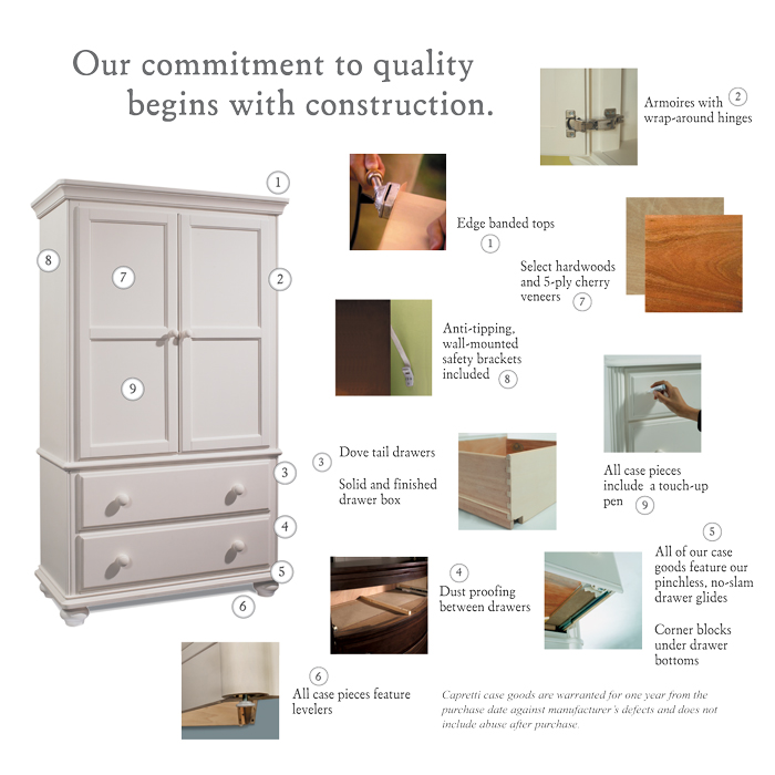

One of the first in-store take-away catalogs I designed for the brand that detailed all of the lines and selling points.
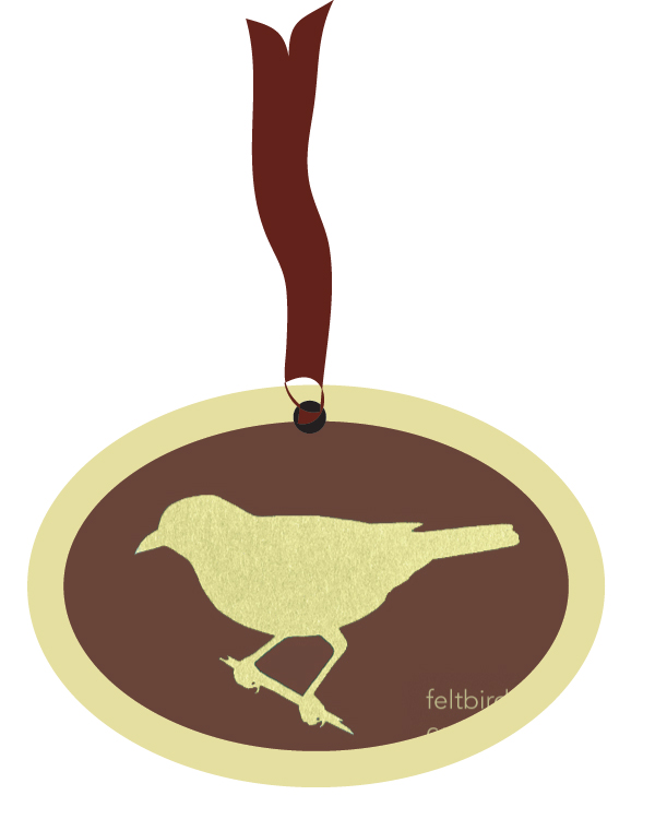
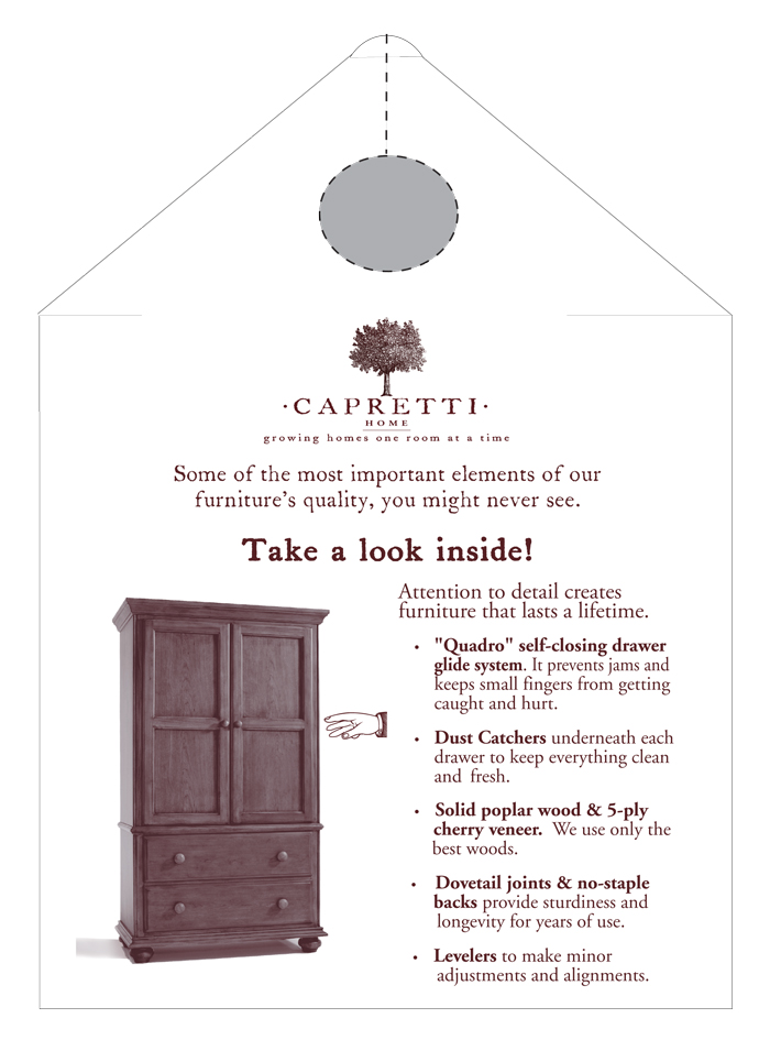
The design for the felt bird medallion that was tied by ribbon to the front of all cabinets displayed in-store. Also, the design for the armoire feature hanger.
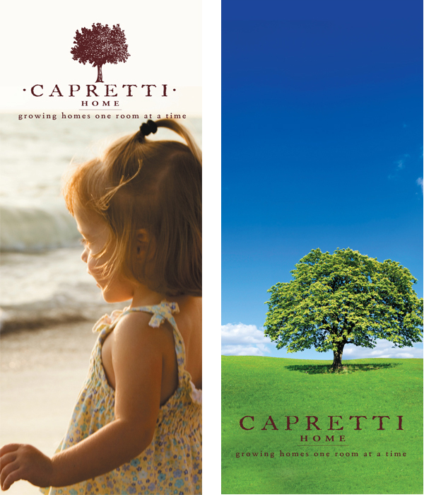
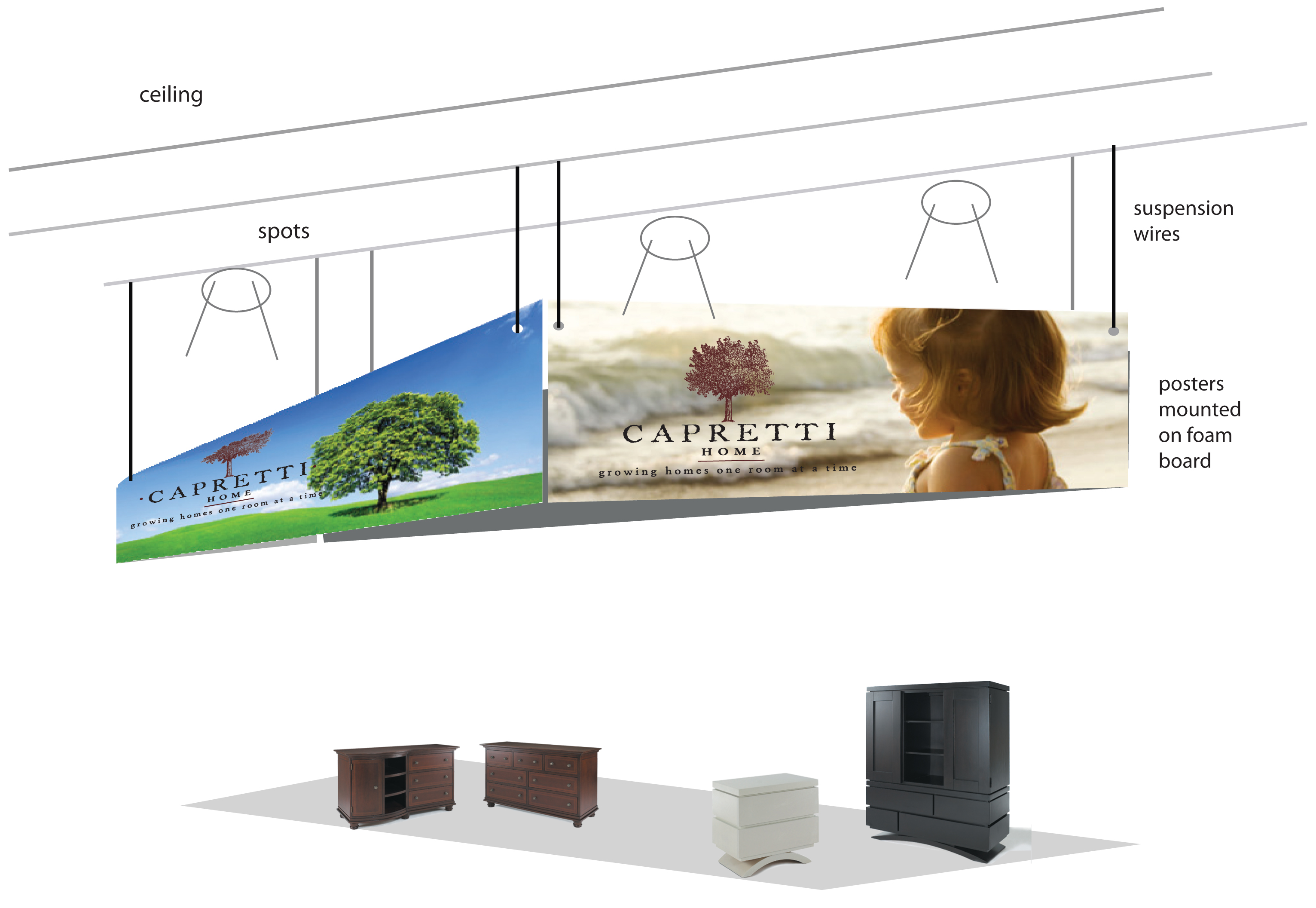
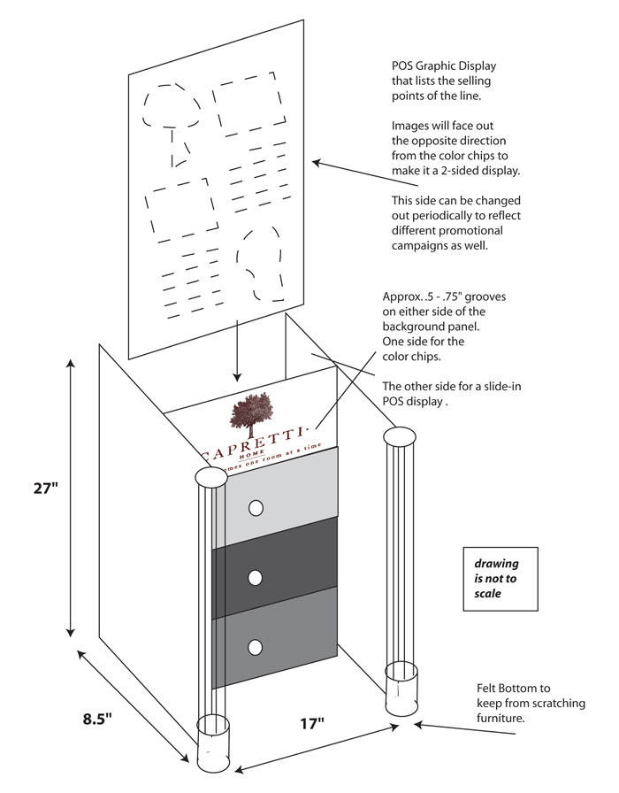
To the left, branding display banners for in-store and trade events. My design for the Capretti trade show booth. And, a point-of-sale piece that I designed to display wood and finish samples. The samples were made of slats that could be arranged or changed out as new woods and finishes were introduced and/or discontinued.


