Promotional Posters
Design
Various | 2005 - 2011
My first true love. All these years later, I still credit my passion for posters and print as the primary influence on my work and efforts as a designer.
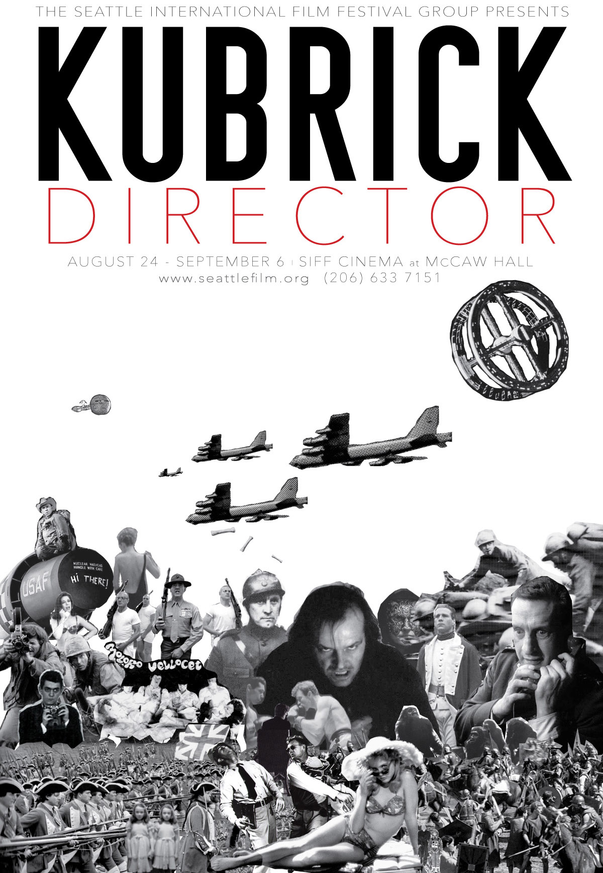
Stanley Kubrick is such a personal hero of mine and his films have informed so much of my visual upbringing that when the Seattle International Film Festival (SIFF) announced they were mounting a retrospective, I begged them to let me design the poster. They eventually agreed. Once I was finished, they were so happy with it that I was able to persuade them to print five at Metro size. I was supposed to receive one for my efforts but it never arrived.
I'm sure Kubrick would have hated the sloppy collage style but I stayed true to his classic single point-of-view perspective for the construction.
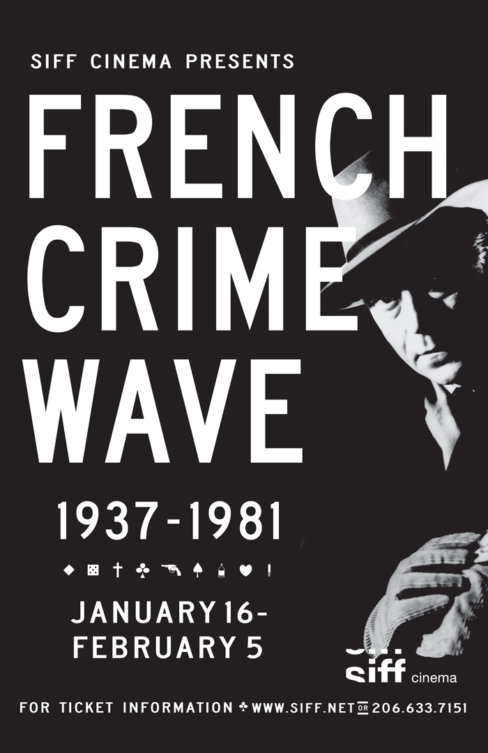
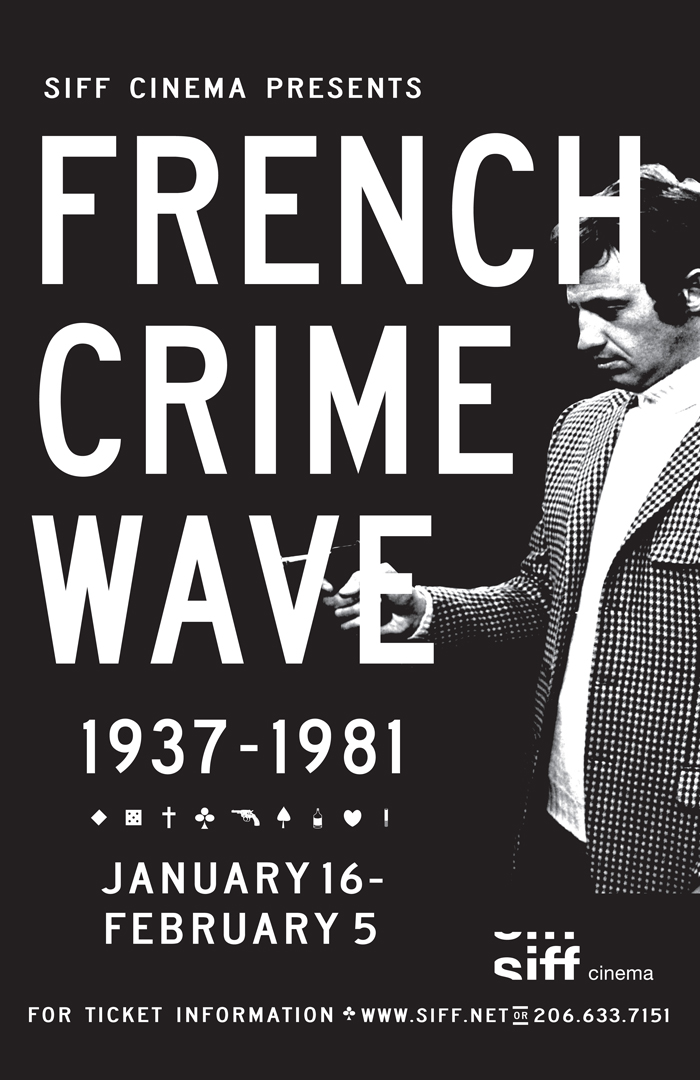
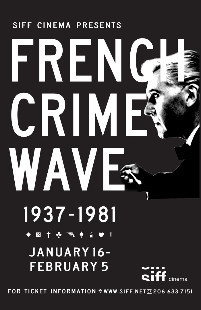
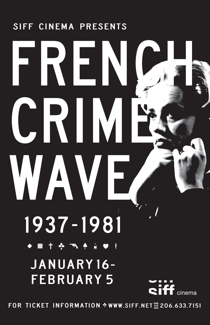
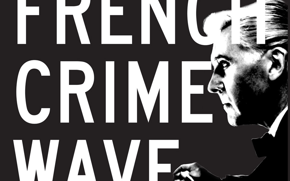
My second assignment for SIFF was a French Noir crime film series. Another part of my film upbringing that has influenced my visual design approach and understanding, especially how best to use and crop images for maximum dramatic effect. SIFF was so happy with the results of the Kubrick poster that they were willing to do a series of four posters total. Looking back, I don't think I truly appreciated how generous of a client they were.
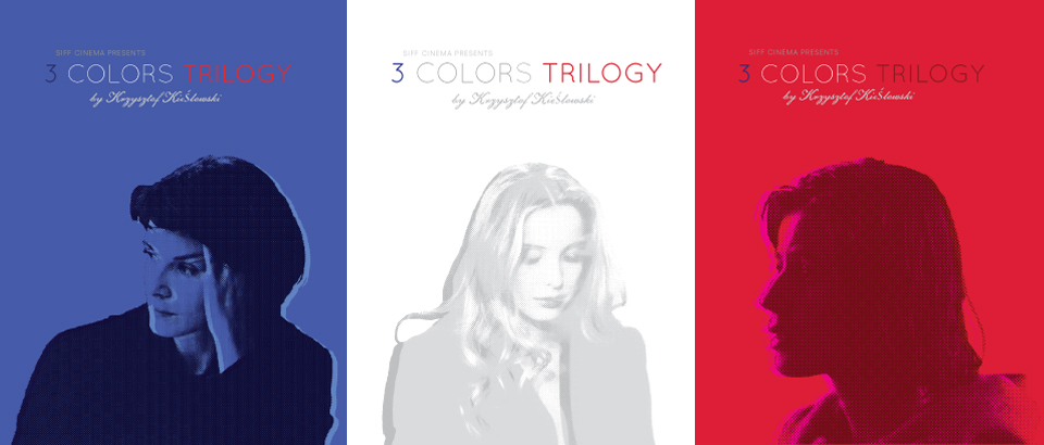
SIFF mounted a screening for the re-release of Krzysztof Kieślowski's Three Colours Trilogy (one color of the French flag serves as the color palette of each film). Again, my generous client offered me the luxury of doing a separate poster for each film.
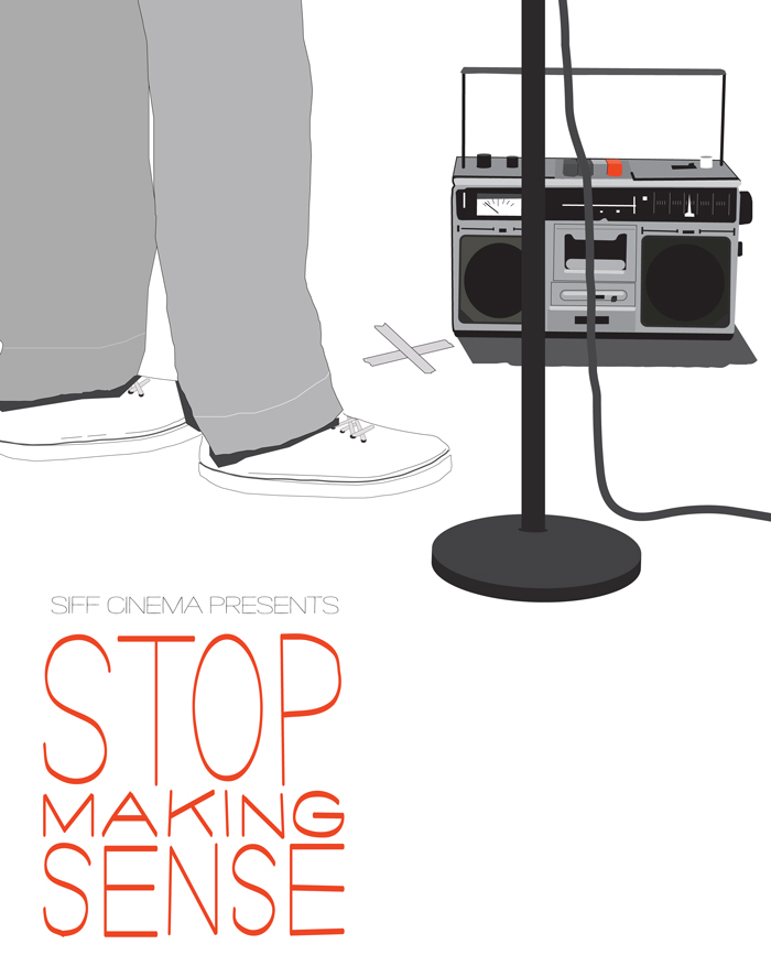
Stop Making Sense was yet another film that left such an indelible impact on me as a future designer but also as a viewer of how design plays such a vital role in performance. It would be sacrilege to not use Pablo Ferro's hand-drawn font so I copied it in Illustrator from the original album artwork. At the end of the day, SIFF didn't have the budget for printing, thus the lack of screening information on this version.
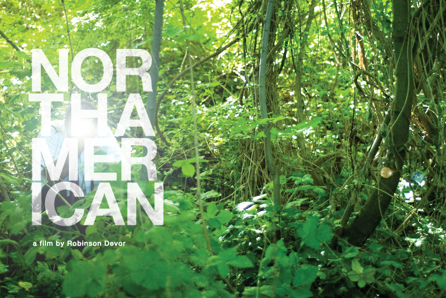
North American is a film by Seattle filmmaker Robinson Devor based on a true story surrounding the events of an airline pilot who suffers a mental breakdown. He needed a placeholder promotional poster to take with him for film festival screenings and asked if I would design something for him. I think in the end, the film stalled from lack of financing but I was happy with how the poster turned out.
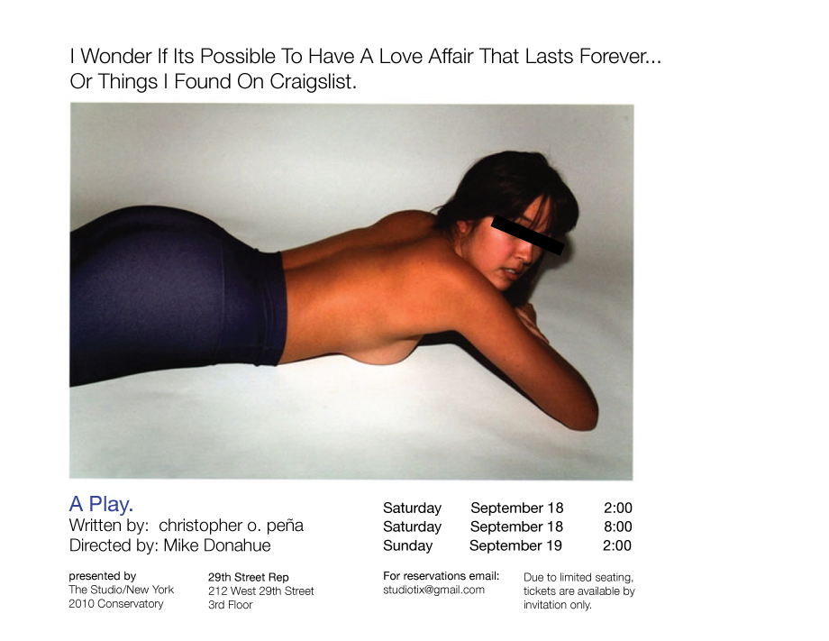
My work with The Studio New York gave me the opportunity to do some theater play posters which are a great challenge and thrill, especially when the material is provocative such as for the play Or, Things I Found on Craigslist. The story had a real kind of cool, loose, smutty feel to it that I immediately thought of the kind of sordid personal ads you would find on websites like, well, Craigslist.
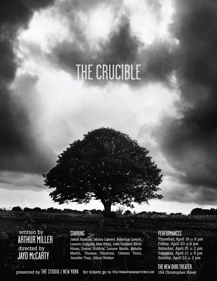
The Studio New York mounts an annual production that showcases all of the current year's students. They asked me if I would design the poster and promo materials for that year's event, The Crucible. That play has so much evocative imagery but I kept coming back to this idea of a great tree as a central gathering place for older communities. I wanted to subvert a symbol that many would see as a sign of growth, tradition, stability and celebration.