Keith Hines Fitness
Design
NYC | 2010
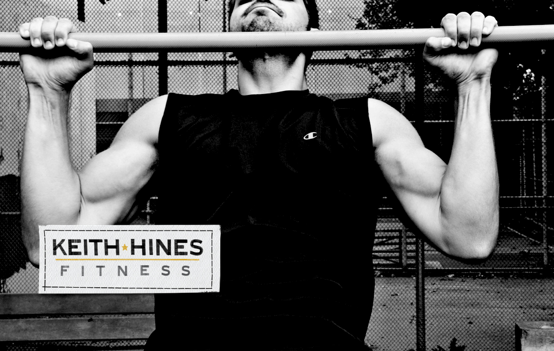
I met Keith through The Studio New York when he was an acting student. He's since made the big time but as a sideline, Keith started his own personal training business. He needed some branding and collateral that he could use for marketing and a future website that he wanted to build himself. There was already beautiful photography shot at one of his training sessions which served as a great place to start.
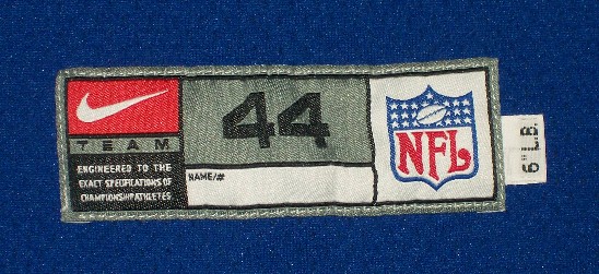
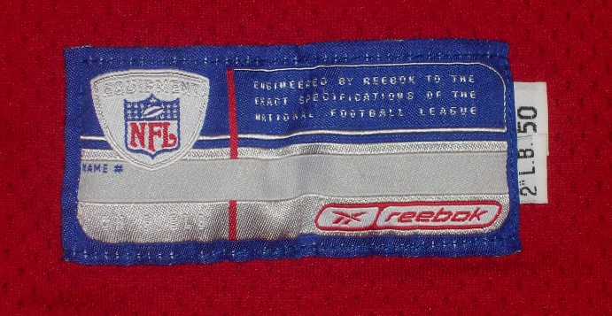
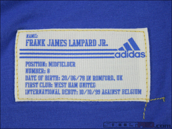
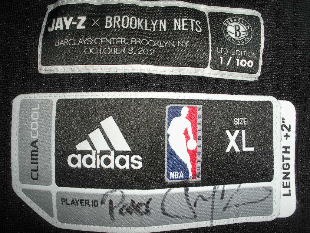
I started thinking about an element that I could layer atop of the existing photography and the idea of stitching something to it leapt to mind. From there I started thinking about all of the cool tags on alot of specialty and throw-back sports jerseys.
I particularly liked the overstitch with the yellow thread on the blue background and the uneven, used look of them.
Keeping with the imperfect, machined aspects, I wanted to make the logo look like part of a fitness brand. More like a utilitarian piece of equipment or great hoodie instead of the lifestyle approach that many personal trainers take. I particularly like the uneven aspects of the labels and the inconsistent look of the stitching so that everything is just a little off and rough. Sewn letters on mesh have a really great textual element to them.
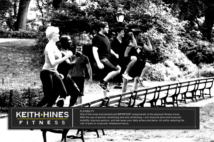
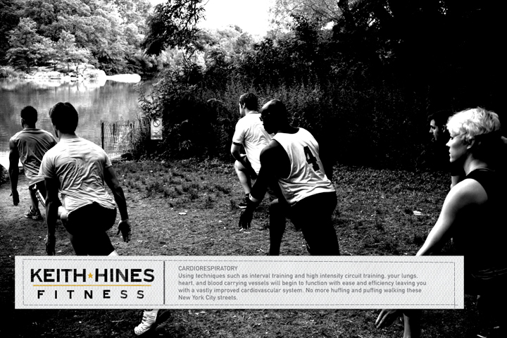
The top two are postcards for mailers or hand-outs. There were five total that each included one of the fundamentals of his teaching approach. It's hard to get away from this too much when you're working with personal training but I think the container helps to contextualize it a bit better.
The bottom two were bookmarks that I suggest he hand out with the exercise books that were required reading for his courses.